New Flag

New Flag
Red Head

Wednesday, October 28, 2015

INKTOBER!
Been so busy with work and life it's hard to carve out time for sketch exercises.  And I'm really feeling it.  It's truly important to keep that hand loose and even more importantly, the mind engaged in observing.  Most people think that the hand eye coordination is the utmost important aspect in practicing drawing but as I get older, it's more the mind.  Draw it in your head first.  The hand and pencil are just the tools~like using a computer.  Be deliberate.  What do you want to say?  What's the story?  What is the attitude?  What is the mood?  Many young artists agonize over finding a "style" but it comes from this type of practice and asking these questions.  With these I am drawing from vintage black and white photos of actors, stage and theatre from the past.  I love the costumes and the tonal gradations.  Here I study the shadow shapes and how they set a mood, describing an era in history, to design the character.  These exercises will prep me for paintings, traditional or digital.  In an illustration, I will start with a thumbnail concept (several), then a rough drawing, then a final "tight" pencil ("tp", not toilet paper, ha, ha) and then start the painting with the shadow shapes, as I learned from Sean Cheatham.  I have to know that the shadow shapes (choosing a light source and it's caste shadows, soft edges and hard edges) work from the get go.  If the tonal exercise has strong presence, and it must, then the illustration will be sure to have power when color is applied.

Monday, October 26, 2015

INKTOBER!  Drawn with my favorite trusty tools~Tombow and Faber Castell brushpens and my Blackwing pencil on a  Strathmore sketchpad, 6"x8".  These pads are great for travel~they are lightweight, can handle paint and take a pencil line nicely, a bit of texture.

Monday, October 12, 2015

San Juan Capistrano

Check out the rich palette, color harmonies and perspective.
Taken at the Mission

San Juan Capistrano

Took a drive south, headed to San Diego, but there was bumper to bumper traffic.  The consolation prize was ending up in beautiful Doheny beach and visiting the Mission at San Juan, first time.  Was struck by the partial remains of the basilica near the gift shop.  Beautiful warm and cool shadow shapes and textures on the fascade.  20-25 mins here, heat wave, hotter then Hades.  If I stayed on this exercise, would've missed the rest of the Mission

Wednesday, September 23, 2015


Progression:  1.  Sketching in the flying dragons.  At this point, I can see that many are the same size, which normally would not happen in Nature.  I scan them into Photoshop to size and will rotate a few and resize a few.  The ones lower on the picture plane will be larger, the ones flying up to the character's hip will be the smallest.  All the while, I imagine what they might sound like.  Something like loud shrieking Amazons (parrots) in the Rain Forest.  A spiky noise.  I'm taking great care in the negative spaces between the parrots, I mean dragons, so that some are grouped and some overlap.  I'm also repeating a subtle pattern of diagonals in the wings that repeat the diagonals in the human sprite.
2.  I redraw the Sprite to make sure she flows, looks natural because the previous drawings lost the thrust of the original thumbnail sketch, which has so much more dynamics (doodled on Steve Irwin's thank you letter of a donation of $20).  I take even greater care to make sure the final drawing will have what the energy of the thumbnail began.
3.  Putting it together to check to see if the Sprite and dragons mesh.  Looking good, but I will  have to lower the dragons (cluster of dragons?  Flock of dragons?  Gaggle of dragons?)  away from fur vest for a better read.
4.  I spray a little atmosphere into the background, because at this age, the bright contrast of line work against sheer white is killing me and giving me a headache.  I higher that arm a bit  (cut and paste and reposition) and add a flying dragon about to roost on that outstretched arm.  Plus I ad a ghosting hint of a background, but not too much now.
5.  Tightening it up.  Going over lines with a more definitive line, "making it real", giving it volumne on trace paper.  Drawing with a blue Col Erase pencil which is unwittingly, 2 inches long.  Whoops.  Really short now that I keep sharpening it.   Praying and searching that I have another blue Col Erase pencil to draw in the characters.  Another small problem:  Paper is too small, so I tape and piece another paper to extend drawing surface.  Ok.  So I'm tired...

Sunday, September 06, 2015

Getty sketches

Had a rare moment to step away from the computer and get out into some sunshine.  These were done at the Getty on the 405.  To my dismay, they have discontinued the water fountains which run down the steps and the big center rock fountain in the Plaza.  It's for "perceived water waste" I'm told, even tho the water is circulated.  Maybe it will be filled if we get the down pour of El Nino, which is supposed to hit this season.  Anyway, I feel like a cetacean finally coming up for a breath of air before diving deep, deep back down into the dark abyss of work and creativity.  Drawn with my favorite pencil, a Blackwing.  "Painting" with the pencil.

Getty sketches

Flow

Getty on the 405

Sunday, August 16, 2015

Paint exercise

Lunch time painting exercise.  Not exactly the same colors from reference but used colors I like.    I really like the neutrals and eggplant colors.  A good portion of Quinacridone Blue Violet, Burnt Umber, Light Blue Violet, tiny percentage of Cad Red Light and Hooker's Green for weight in the darkest shadows.  Don't know how far I will take this. Sketchbook and acrylics

Tuesday, August 04, 2015


Front and Back:  Dragons were inked in Illustrator with "charcoal" brushes found off the internet to create more of a subtle sketch quality, then brought into Photoshop with the same swirl pattern to relate to the front design.  They are based on some quick thumbnails of dragons that I had drawn here and there.  This concept for the back was a suggestion from my old art director, Sergio Lobato.  Up until then, I had not even considered a back side of the card.  The front will be gloss (to enhance the colors and impact); the back matte. 

I have always loved poster art and this design is like a mini poster, in the tradition of poster art before PS completely took over, and imagination, composition, and color was kicked by the wayside.

Saturday, July 18, 2015

Finally got a small break to clean out the back room.  Came upon several old sketchbooks; leafed thru them.  It's crazy how many sketches I did in several YEARS to finally be able to consistently come up with good ones!  Lawd O'mighty!  The rule about the 10,000 drawings is true!  You have to do that many to be consistently competent!  I did one really "smart" thing~I've never given up.  I hate giving up.  I know I must've drove my mother crazy growing up.  (I was such a persistent perfectionist.  Not so these days.  Just having fun.)  Drawing the figure over and over, drawing animals over and over, drawing clothed figure over and over, one sucky color sketch after another, banging my head on the wall~hard~over and over.  I ask myself:  Why   did   it    take   so   long??

Above:  playing with the brushes yesterday.  Needed to come up for some air.

Saturday, July 11, 2015

Been so busy with work~under lots of stress with deadlines, and sometimes to shake off that stress, it really helps to draw.  This was done yesterday morning, in about 20 minutes.

I actually draw a lot from reference because:  it's just plain enjoyable and keeps the hand loose and helps to prep me to do inventive figure, a lot of times, without reference.  I've never been one of those people who can just doodle from subject to subject, in a variety of compositions, and themes.  I've always admired those who can do that.  I need time to warm up, and like to stick to one subject and "plus" that out, explore many options from a single theme.  I love visual stymuli; that's what gets me going.

This drawing style is one that I learned from Paul Wee (The Simpsons) who learned from Mark Westermoe.  I also took a few classes from Mark, who called it "painting with a pencil", and conversely, in quick color renderings, (color thumbnails) call it "sketching with the brush".  They both taught me to lay down the long guidelines you see in my sketches.  When I first got to Southern California, was floored at the commercial drawing style here.  In the Bay Area, it's more self taught and "fine art', but in Los Angeles, because of the studios, it's much more disciplined and figure drawing and animal drawing is taken much more seriously.  Paul Wee drew the most drop dead gorgeous figures I had ever seen.  Poetry, really, a smooth velvety line on newsprint, which I learned from him.  And Mark Westermoe, who taught him, suffered from pronounced tremors, which actually, I think, enhanced his drawings and made the charcoal more random, but because he was so good at designing shadow shapes and shading and giving volumne to the figure, his work was outstanding also, tremors or no.  It was "calligraphic", purposely organized design.  I always found him to be warm, encouraging, and loved drawing.  Paul is not so good with words, as Mark was, or he wasn't back then, but his teaching was thru is outstanding demos.  I mean, I literally had to cancel whatever I learned about drawing, to pick up this new style.  I had to learn to draw all over again.  It was humbling but so worth it.

Most great artists had mentors behind them or good instructors.  Norman Rockwell loved JC Leyendecker's work and you can see the influences~esp. in his toddlers.  And Frank Frazetta was taught by an Italian painting master when Frazetta was a teenager.  I am greatly influenced by Mark and Paul's flowing style and I learned structure and surface anatomy from Steve Huston, when he used to live in Southern California and taught at Disney and Dreamworks studios.  I learned how to create a great sketchbook from the late Barbara Bradley of the Art Academy in SF, when I lived in the Bay Area.  But I've had many more influencers since then, some from the web and some from friends.  The important thing is to keep sketching; keep that pencil, pen or brush moving~


Monday, June 29, 2015

Some quick doodles.  They are a combination of male human anatomy and animal anatomy.  These are so much fun because they have a wonderful flow; from the head to the tail and lots of ellipses thrown in.  Lately I tend to draw them a lot because of the opportunity of "gestural calligraphy" of which I had learned from Mark Westermoe and Paul Wee many years ago. 

Been so busy with work, personal projects, kid home from school (summer break), and getting rid of lots of stuff to Goodwill and Salvation Army; cleansing my home and continuing the fight of keeping my landscape alive thru this horrible heat.  Only been to the beach once.  No time to paint (traditionally) but I am making progress with the most gorgeous business card and hopefully will have it done soon~and printed.  Then I can finally do a bang up job on doing the final pencil on Shoten Zenjin now that I have the printer up and running~YAY!

How has your summer progressed?

Another side project~I've been also making some incredible jewelry to sell; combing the local Swap Meet for tiny vintage pieces and beads and wire wrapping them into petite and unique necklaces and bracelets.  Everywhere I go, women want to know where I bought my jewelry and once they find out that I make them want to know if I will be selling.  Currently I've made about 10 beautiful and precious pieces and will be selling them in Ojai~dat's the plan and then have some available on the internet.  But not ready yet.  Will be creating another blog to feature these remarkable pieces inspired from the past that you can wear but not just yet.  I'll keep ya posted.  It is just another extension of how to create color harmonies from vintage and antique pieces while paying attention to silohuettes and materials~based upon my understanding and experience with painting and illustration.  It's inspired by the Victorian and Edwardian Age, of which I've just fallen in love with~KMZ

Friday, June 12, 2015


Also been playing around with some Photoshop brushes that I found free online.  I've heard some really good digital paint artists say that the brushes do not matter, but I beg to differ.  I have been so frustrated with the brushes that I have and maybe it's because I like to paint traditionally and know this method intimately and expect more from digital brushes.  But switching from traditional paint methods to digital is really like learning a new language, at least, for me.  This is a re do for my new business card.

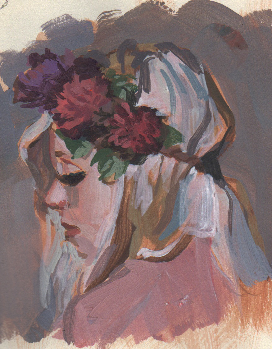
Just a quick little lunch acrylic sketch.  Honestly, I have had no time to do anything traditional these days, but you have to keep the hand loose and the mind engaged.  Bought some "rounds" (brushes for sketch) online from Utretch for Mother's Day gift to self and just now am playing with them.  This is done on a sketch tablet (real paper here, people) Strathmore Drawing Medium pad which I use as my traveling sketch book for now.  These are great; I carry a few 6"x8" tablets because they are light and don't get the attention a bigger sketch tablet might for discreet sketching in public.  The late Barbara Bradley of The Art Academy had encouraged me to use these instead of a heavier bound sketch book.  They can handle sketches as well as paint, altho paint colors are muddy because the paper is not the best quality.  I still like my Bristol Vellum papers which help to capture the colors in the fibers instead of dulling them out like the Strathmore sketchpads.