
New Flag
Red Head
Monday, June 11, 2012


Wednesday, May 23, 2012

Sunday, May 20, 2012
Elizabeth: The Golden Age
So many shots, so very little time...This is one of my favorite scenes in this movie. Sir Walter Raleigh walks in on the Queen and they are alone and she is frantic over having to execute Mary, The Queen of Scots after finding out Mary was plotting to have Elizabeth killed. Says Walter R: "Since when were you ever afraid?" To which Elizabeth, very honestly says, while looking down, "I am always afraid." I think it is these moments of honesty in her character which makes her so human, while appearing so invincible to her people, that make her so entertaining to watch. I spent time on this one and could have continued for another week, but I want to move on. This was done in segments of time.


Sunday, April 29, 2012
Tomb Raider
n
 Finis~I put some red in the nose to warm up the flesh a little. This one turned out really nice. 9"x4 1/2", acrylic on Bristol paper. This one was such a departure from the mood of the previous shots from Elizabeth: The Golden Age, it took me a while to adjust but I do have more shots I would like to paint from this darkly shot film.

Thursday, April 19, 2012


Monday, April 16, 2012

Elizabeth: The Golden Age
A visit back to the screen shots. I went for a bigger format, 8" by 5" roughly, on a thick watercolor sketchbook. I found while I do really enjoy painting the screen shots and have really missed doing them, I needed a bigger surface so that I can concentrate on turning the form with warms and cools. I brought the pallette down to 7 colors: black, white, Hooker's Green, Cad red light, yellow ochre, Magnesium Blue and I will sneak in a few "guest" colors from time to time if I get a screen shot that needs a specific color.
This film was beautifully shot; Kate Blanchette just glows like alabaster in this one, partly because of the natural light and partly because of the white paint she wears. There are some shots in which she moves in and out of natural sun light~breath taking~so expect some of the same shots painted but with different lighting. I will post more when I get some time.
Sunday, April 08, 2012

Some head studies done at Disney Consumer Products, most of them at 5 minutes. The drawings were done at the Los Angeles County Museum of Art, which is now expensive...$15 admission fee, $9 to park and it opens up at 12 noon! And they guard the exhibits like Nazis...they would not allow me to bring out my mini kit of acrylics that I premixed in ANTICIPATION to use. Only pencil. Not the best place to study..any suggestions to study dynamic light on figure where I can crack open the acrylics? Anyone??
Saturday, March 10, 2012


These were done for Bob Kato's class at Disney Consumer Products yesterday. The top two were five minutes, yes, five minutes, so the challenge was trying to capture the gesture and basic silohuette in that time. The bottom right two were the last ones~10 minutes a figure and a little more time to breathe. Check out the last one~this time i used a Burnt Umber for the ground, and in the figure, some Hooker's green, Cad red light, yellow ochre with the dominate base of Ivory black and Titanium white. I managed to get a step of gradations of values in warms and cools, a method taught by Sean Cheetham, a few months ago. This is the direction I am heading and this figure is the most successful. The warm and cool relationships and the brushwork is finally coming together! I did not get the model's name, he is half vietnamese and causcausian, does stunts with fire, looks 21, but is 38! He gave us everything, outstanding silohuettes, acting, intensity, amazing physique and had a great sense of humor!
Tuesday, March 06, 2012

Friday, February 10, 2012


Thursday, January 19, 2012


S'more figure. The black and whites were done yesterday; the model was Adair. Some color figure done a few weeks ago of the amazing Stacy Walker. What presence on stage! And a small portrait of the charismatic Mr. Quantae Love; I will get to some really nice ones of you in the future, Mr. Quantae! You are simply one of the best figure models in the industry! And a big thanks for Mr. Ron V for guiding me in all this.
Saturday, January 14, 2012

These have been done in a figure drawing class and Bob Kato's class at Disney Consumer Products. And yes, they were painted the back of a crescent board~I hate waste..They were about 5-10 minute poses in acrylic. I am still having trouble with my warms and cools so that is why I will be working in black and white for awhile. I am in a large learning curve with both digital techniques and traditional and infact, feel like the girl in Matrix when she plugs into a program to learn to fly helicopters; I come home wiped and overwhelmed almost everyday!
Friday, January 13, 2012


Monday, January 02, 2012

Sunday, January 01, 2012

Tuesday, December 27, 2011

A bit overworked~
but finished. A couple of days before X-mas, my daughter passes me strept throat. I'm just now finishing up with my last dose of antibiotics which makes my hands shake and puts me in a fog and really messes with my decision making when painting. (I also get cranky) It is hard to paint this way, since usually I know exactly how I'm going to paint a picture; what I wish to say and how to do it. It's like I've jumped into another's head and have no idea on how to start. In 48 hours I will be myself again.
I moved the left eye up and made it smaller, but in the process, lost the sparkle of the original eye. The unevenness was driving me crazy; so now it is more correct but not as interesting...oh well..most times that happens..
I flew home from the Bay Area yesterday and had a decision to make. I only had room in my suitcase to either: pack my clothes or pack my paints. I left my clothes with my Mother In Law. Hubby and daughter stayed and man oh man, is it peaceful. I really look forward to this once in a year solitude!
Sunday, December 11, 2011

Sunday, December 04, 2011


Wednesday, November 23, 2011

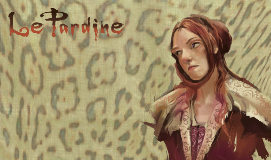
A return back to digital. Gonna step away from the traditional and catch up with the digital. Been so freakin' busy these days, hard to find time to work on anything personal. The ugly/beautiful and savage LePardine. This is the underpainting for now. I may change the lips since they are looking a little Botoxy. And I'll probably come back and soften her face so she looks less harsh and starved...Have a Great Turkey Day, everyone!
Saturday, November 05, 2011
Friday, October 28, 2011


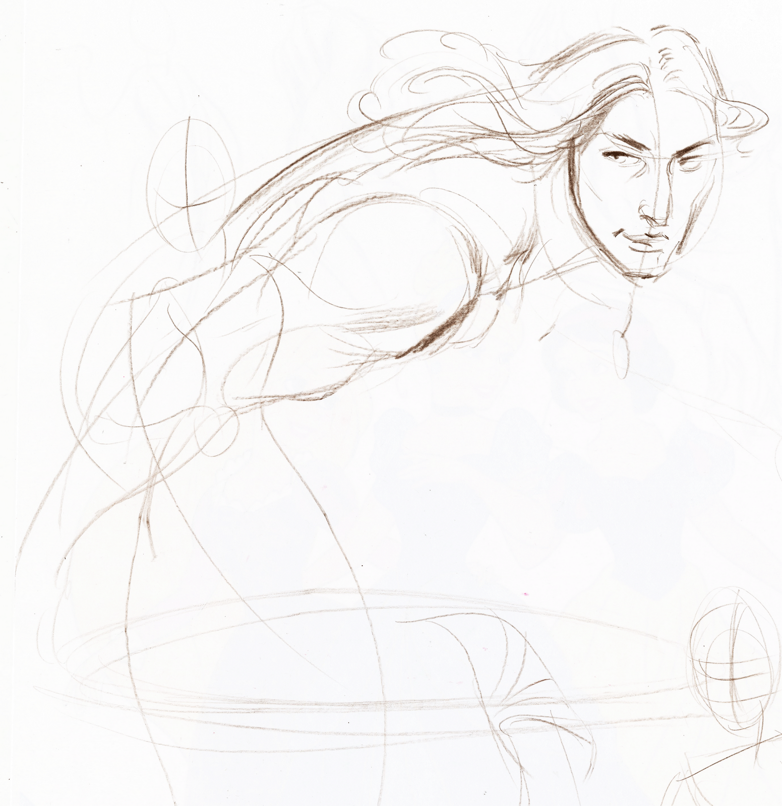
I will be out of town this weekend so I probably won't get time to paint. I am also taking instruction from master portrait painter, Sean Keecham and so must wipe my slate clean of all methods I use in order to paint and adopt his. In order to step forward I will take steps backward and start at the very beginning~only dealing with shadow and shadow colors and transitional midtones..
Sometimes I "doodle" at work and here are some sketches to keep the hand loose...
Saturday, October 22, 2011
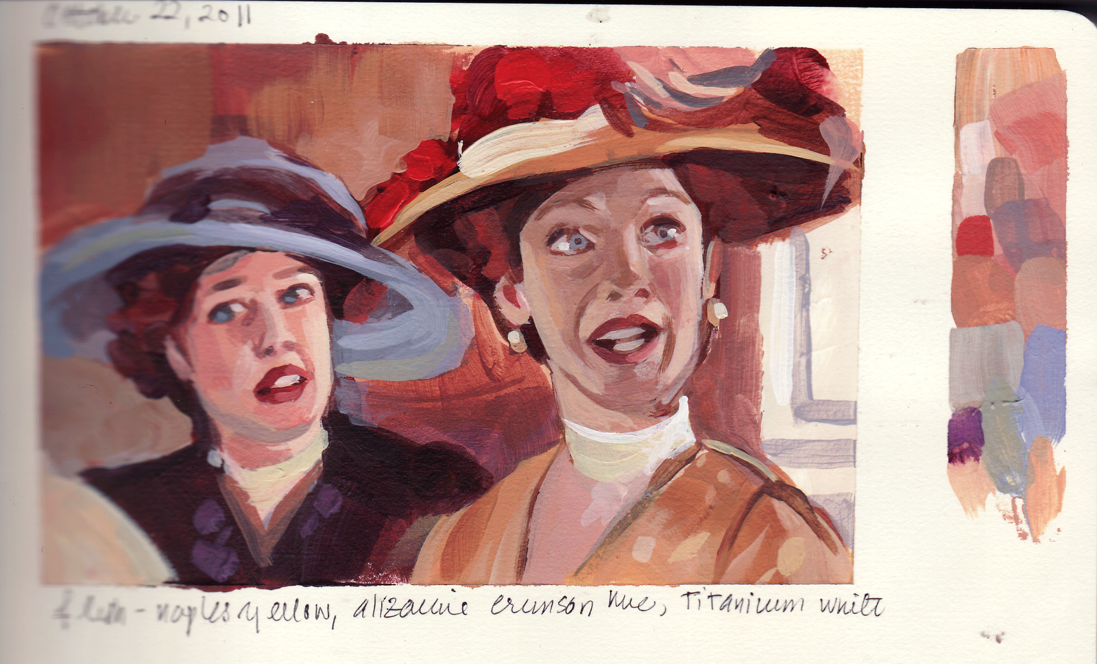
From Titanic. Okay~this is not one of my favorite movies and I have a lot of problems with it. From the cartoon like characters, sappy dialogue and a downer of a plot, it did have some positives. The costumes are incredible as well as the special effects. One of the problems I noticed was that as I was speeding thru the shots, there were very little variation of camera angles, colors or mood. Because of this, even with the sound turned off, the movie did not elicit much emotion from me or engage me to care much about the characters.

From a pic off my husband's FB. I wish I knew who took the photo which inspired this painting because it is beautiful and I did not do it justice. If I knew the name of the photographer I could give them credit and a kudos for having a terrific eye. I actually did this last Saturday but am just getting around to posting it.
Sunday, October 09, 2011

Saturday, October 08, 2011

Sunday, October 02, 2011


A day late, but worth the wait..
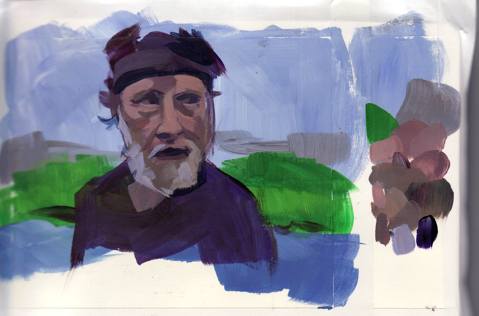
The figure on the right should have been about 25% bigger, but the mosaic of colors turned out so nice I did not resize it. Autumn colors, Siennas, yellow oxides mixed with purples, lavendars.
For those of you new to my blog, welcome! I am studying filmshots from different movies. How do you tell the story with warm and cool colors? By layout, composition, camera angle, lighting, emotion? What was the director thinking? Was it successful? Was it not?
These are all acrylic studies, some no bigger than a postcard, some smaller, in a pocket sized sketchbook. They can take anywhere from 20 mins to 3 hours (esp. if there are more than 2 figures or I am having a bad day). Ultimately, I will be taking this paint style to Photoshop using quick, colorful, casual and energetic and emotive brushstrokes to story telling illustrations. And ultimately, ultimately will take this to large canvas, original work inspired by those of the Golden Age of Illustration, the large kind of work you don't see anymore.
Saturday, October 01, 2011

Sunday, September 25, 2011


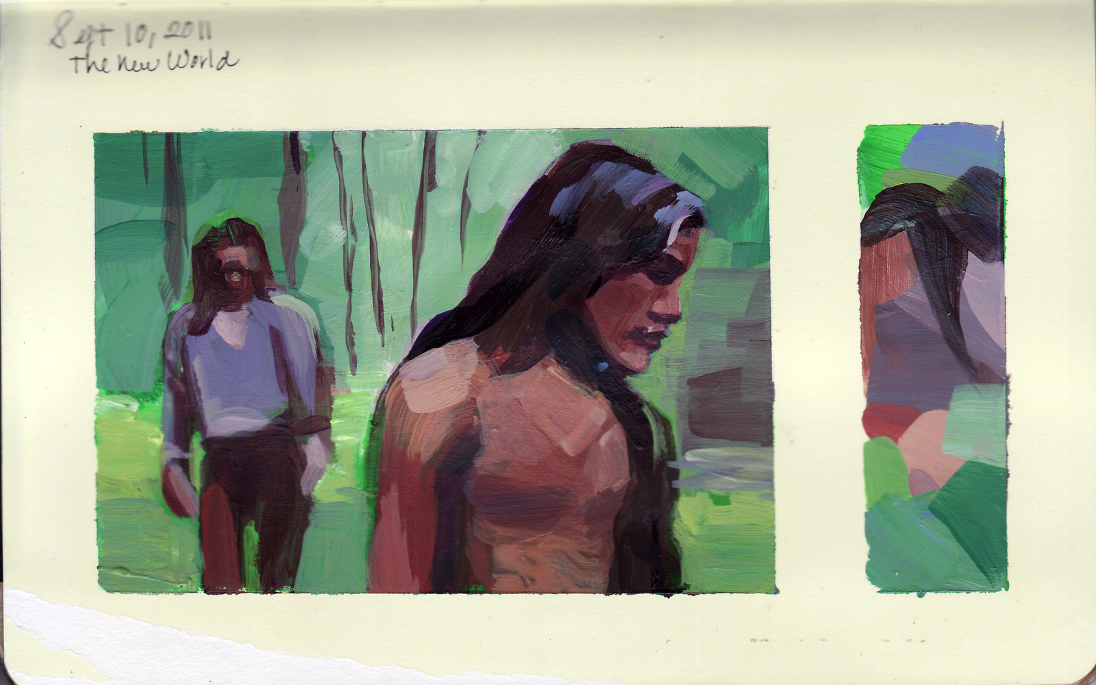
Despite a busy weekend, I managed to get these out. Painted in my new sketchbook, which has crap for paper, but I will fill this and trade out for one with better paper; hopefully. I love the New World shot colors; the charcoal black and greys are actually a base mix of Thalo Green and Alizarine Crimson and variations of red oxide, light blue violet, thalo blue, dioxe purple, burnt umber, cerulean blue and titanium white. Was able to get some wonderful color harmonies against a saturated green backdrop.
Sunday, September 18, 2011
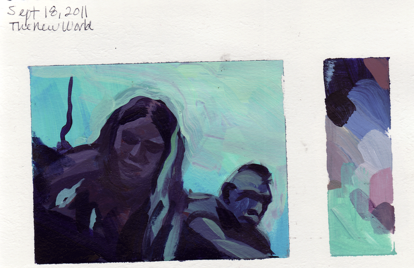

Struggling to find a good paper book to paint in:
The Hidalgo shot is a sketchbook I found at an art sale at Swain's yesterday and the blue shot is done on a watercolor sketchbook from Japan. The watercolor surface with acrylics drove me crazy, but it's worth revisiting again because the paper is so thick and strong. It's really hard to find the kind of book that I need: it has to be proportioned so that it accommodates a wide screen format with extra room on the side for a color pallette, (has to be small and light enough to carry in my backpack) pages have to be thick enough to support acrylic paint and I would prefer a tooth to the surface, not as rough as the watercolor paper which absorbs too much. The best surface is the Strathmore Bristol Vellum surface but that comes in a pad. It seems whenever I switch papers, it's like learning to paint all over again!
Monday, September 12, 2011
STRONG TO THE FINISH
This is the last entry in my Color Journal Sketchbook. The book is now complete; one of the most impressive collection of work in a sketchbook I have ever done. I will now leap to a new one, a Multi-Drawing Book for Water color and multi-media from Japan which has more tooth to the surface. It is more of a binder than a book and much lighter to carry. This was actually finished on Saturday, but I am just now getting around to posting it.
Sunday, September 11, 2011

Where Have I Been?
Okay~about a month ago I had so many obligations and responsibilities and did not get a chance to paint; let alone think about it. Then the next weekend comes around and my daughter won't stop talking while I try to work. Also the heat melts my brain. Labor Day comes around and I think: Wow! Three days to paint! And BAM! my daughter comes home from school and gives me her cold. We are laid out for 2 of the 3 day weekend. Monday we go to the beach and there goes the weekend. This weekend, my daughter does something to the computer and it won't leave a high magnification mode and makes it really difficult to navigate the computer (which holds all my screen shots!) when finally her friend's mother said try turning off the Universal Access toggle. The Universal what? We found it under the Apple Icon, System Preferences and suddenly I am back in business!!
Thru this forced Hiatus, I found myself back to square one; like I'm starting all over again. This one's done on Strathmore Vellum pad, again from The New World. And this one's for my Dad. Sorry I gave away the Sheik painting, Pop, if I knew you liked it so much, I would have given it to you!
Saturday, August 13, 2011

NEW WORLD DRAMA
Chief Powhatan and friend discuss the fate of the smelly Englishman, John Smith in a bizarre and frightening scene.
Okay~I struggled with this one. High contrast, no saturated colors, it was an exercise in purples and oranges. It was hard to make the color harmonies interesting and not go flat. Or maybe it was just one of those days when painting is an uphill battle...Also I am coming to the end of this book so part of the scans are now out of focus...
Saturday, August 06, 2011

New World
This is truly one of my favorite films, very introspective and spiritual. I love this segment of the story; it is very sensual and tender. I always cry when I watch it. I love Terence Malick's statement about the intensity of emotion and complexity of relationships and his portrayal of the beauty and power of nature. Not a film for everyone, however, it puts my husband to sleep.
Lots of beautiful color harmonies here, purples mixed with yellows and oranges, purples in the shadows, lots of muted colors.
Subscribe to:
Posts (Atom)