New Flag

New Flag
Red Head

Wednesday, November 23, 2011


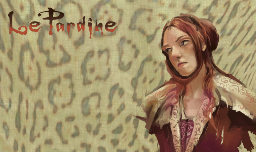
A return back to digital. Gonna step away from the traditional and catch up with the digital. Been so freakin' busy these days, hard to find time to work on anything personal. The ugly/beautiful and savage LePardine. This is the underpainting for now. I may change the lips since they are looking a little Botoxy. And I'll probably come back and soften her face so she looks less harsh and starved...Have a Great Turkey Day, everyone!

Friday, October 28, 2011


I will be out of town this weekend so I probably won't get time to paint. I am also taking instruction from master portrait painter, Sean Keecham and so must wipe my slate clean of all methods I use in order to paint and adopt his. In order to step forward I will take steps backward and start at the very beginning~only dealing with shadow and shadow colors and transitional midtones..

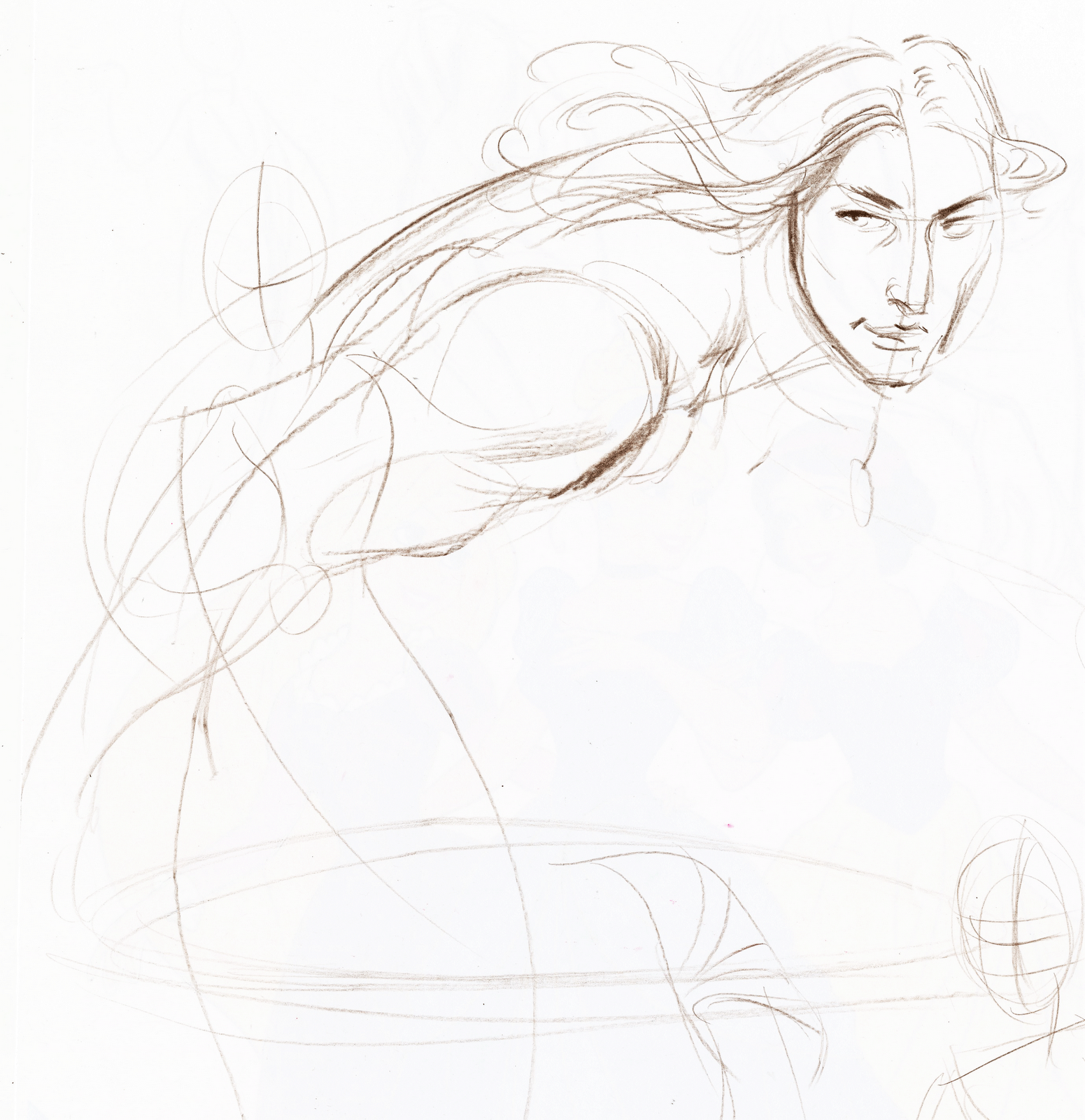
Sometimes I "doodle" at work and here are some sketches to keep the hand loose...

Saturday, October 22, 2011


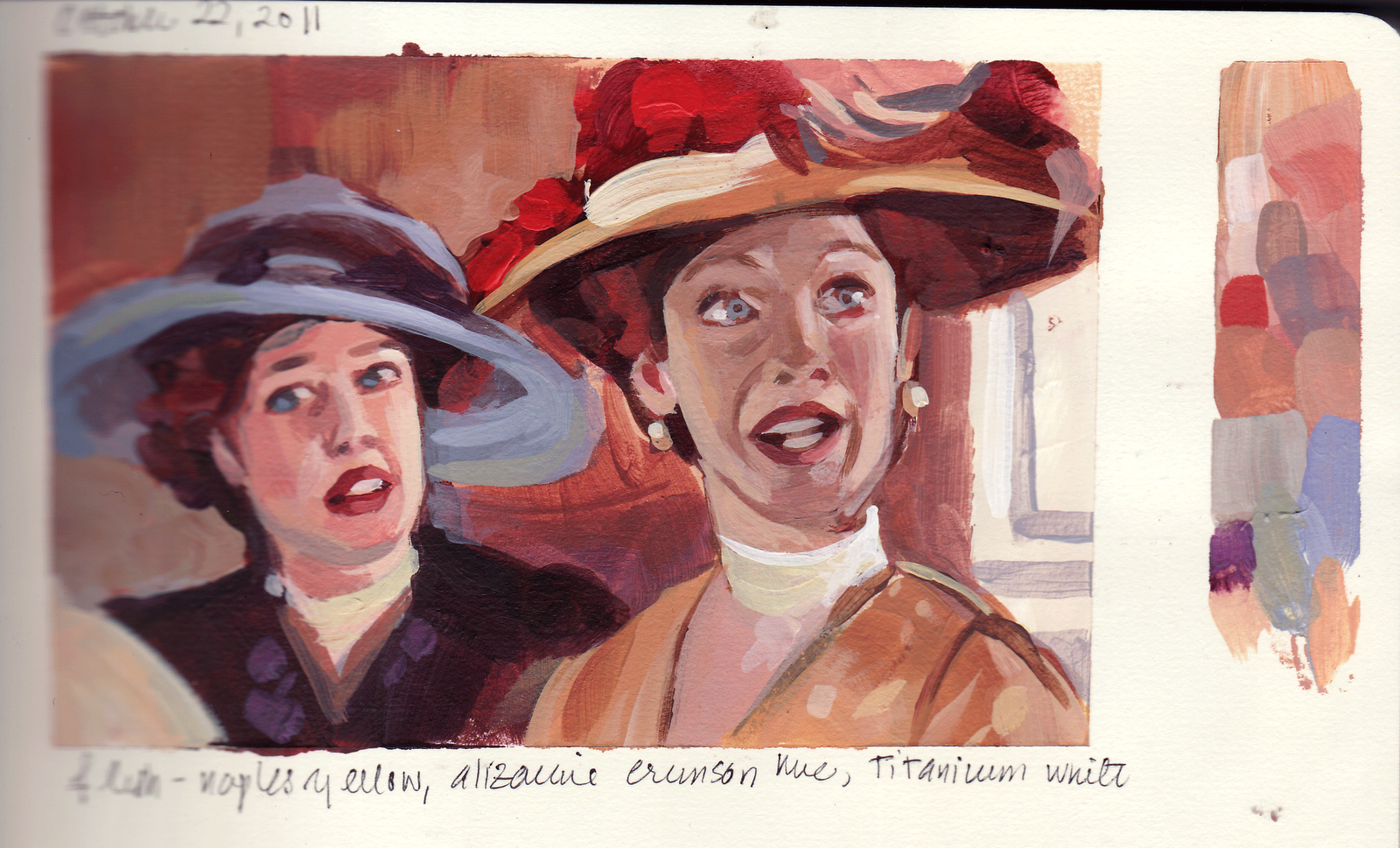
From Titanic. Okay~this is not one of my favorite movies and I have a lot of problems with it. From the cartoon like characters, sappy dialogue and a downer of a plot, it did have some positives. The costumes are incredible as well as the special effects. One of the problems I noticed was that as I was speeding thru the shots, there were very little variation of camera angles, colors or mood. Because of this, even with the sound turned off, the movie did not elicit much emotion from me or engage me to care much about the characters.

From a pic off my husband's FB. I wish I knew who took the photo which inspired this painting because it is beautiful and I did not do it justice. If I knew the name of the photographer I could give them credit and a kudos for having a terrific eye. I actually did this last Saturday but am just getting around to posting it.

Sunday, October 09, 2011


Limited Color Palette
Ron at work suggested that I try a limited palette. This was done at work during lunch break.

Hardly anytime to paint this weekend! :(

Saturday, October 08, 2011


A little overworked. Speed painting 101, because now I have to make lunch and run kids to the dentist...will try to finish the other painting...

Did this underpainting at work. Established the tone, mood, lighting in 25 minutes. The rest should be cake.

Sunday, October 02, 2011


Sneak Peak for Next Week!

This is how I start, big bold strokes, values, color. I had some left over color on the palette and I hate wasting, so I knocked out this underpainting. See you next week! :)

A day late, but worth the wait..

The figure on the right should have been about 25% bigger, but the mosaic of colors turned out so nice I did not resize it. Autumn colors, Siennas, yellow oxides mixed with purples, lavendars.

For those of you new to my blog, welcome! I am studying filmshots from different movies. How do you tell the story with warm and cool colors? By layout, composition, camera angle, lighting, emotion? What was the director thinking? Was it successful? Was it not?

These are all acrylic studies, some no bigger than a postcard, some smaller, in a pocket sized sketchbook. They can take anywhere from 20 mins to 3 hours (esp. if there are more than 2 figures or I am having a bad day). Ultimately, I will be taking this paint style to Photoshop using quick, colorful, casual and energetic and emotive brushstrokes to story telling illustrations. And ultimately, ultimately will take this to large canvas, original work inspired by those of the Golden Age of Illustration, the large kind of work you don't see anymore.
Saturday, October 01, 2011


October Gorgeousness:

So many good color harmonies in this one, could give love to it all day...Will attempt to get another one out today!

This horse in this film is just beautiful to look at. Been wanting to do this shot for a long time..

Sunday, September 25, 2011


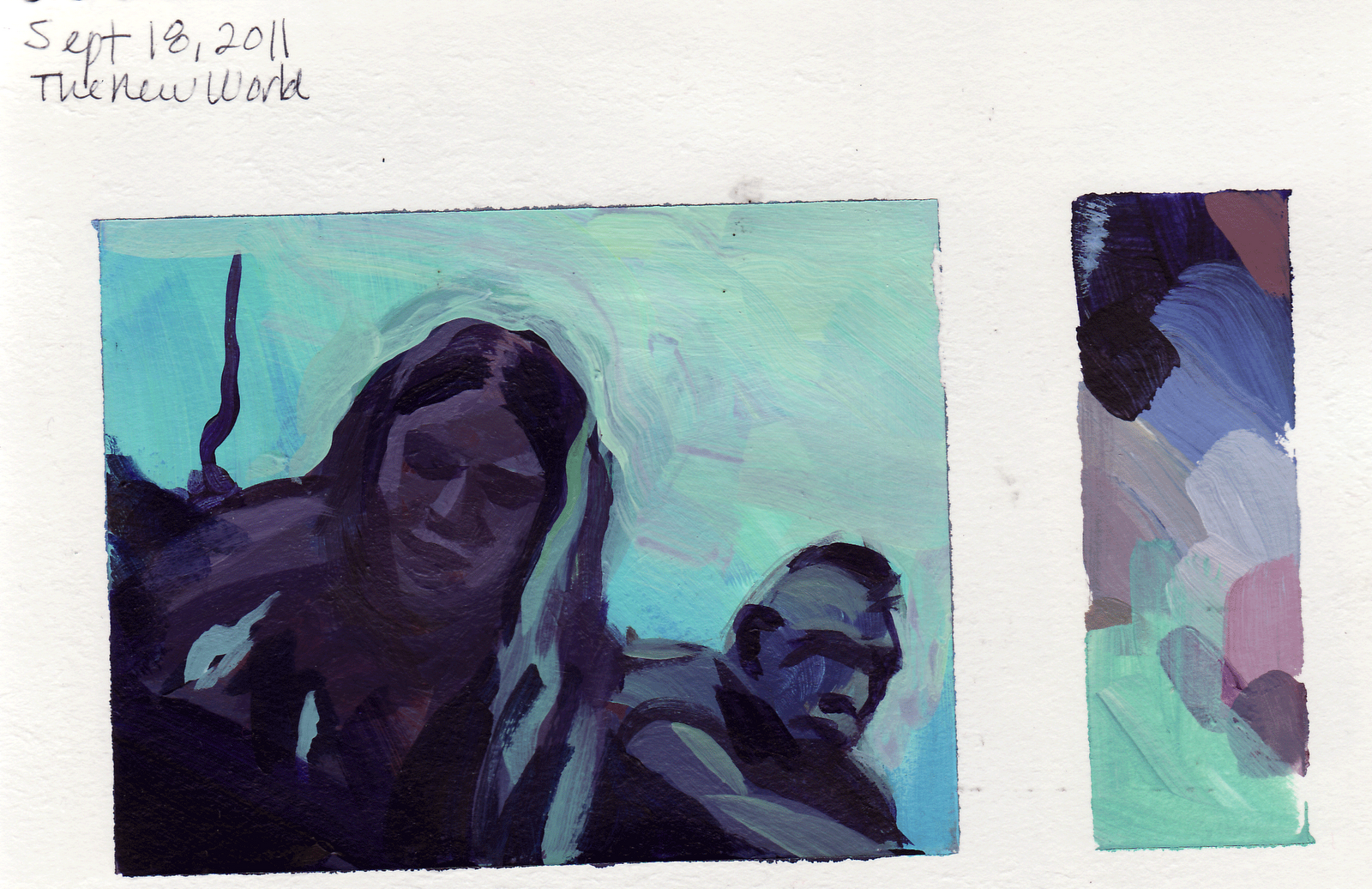
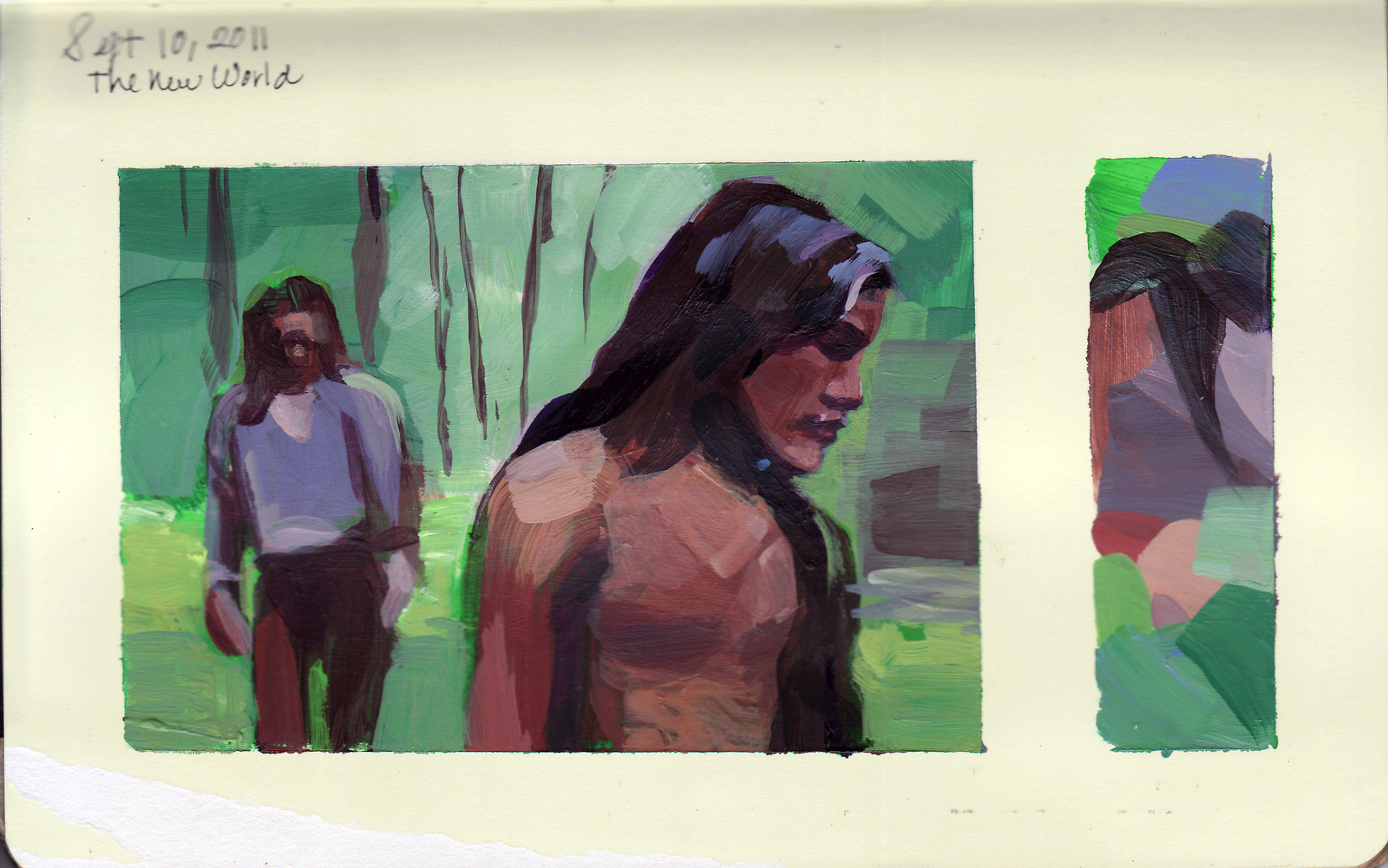
Despite a busy weekend, I managed to get these out. Painted in my new sketchbook, which has crap for paper, but I will fill this and trade out for one with better paper; hopefully. I love the New World shot colors; the charcoal black and greys are actually a base mix of Thalo Green and Alizarine Crimson and variations of red oxide, light blue violet, thalo blue, dioxe purple, burnt umber, cerulean blue and titanium white. Was able to get some wonderful color harmonies against a saturated green backdrop.

Sunday, September 18, 2011


Struggling to find a good paper book to paint in:
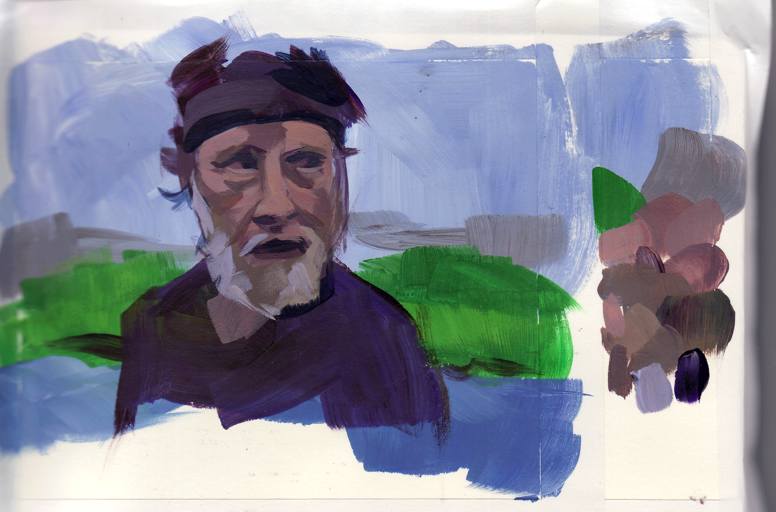
The Hidalgo shot is a sketchbook I found at an art sale at Swain's yesterday and the blue shot is done on a watercolor sketchbook from Japan. The watercolor surface with acrylics drove me crazy, but it's worth revisiting again because the paper is so thick and strong. It's really hard to find the kind of book that I need: it has to be proportioned so that it accommodates a wide screen format with extra room on the side for a color pallette, (has to be small and light enough to carry in my backpack) pages have to be thick enough to support acrylic paint and I would prefer a tooth to the surface, not as rough as the watercolor paper which absorbs too much. The best surface is the Strathmore Bristol Vellum surface but that comes in a pad. It seems whenever I switch papers, it's like learning to paint all over again!

Monday, September 12, 2011


STRONG TO THE FINISH
This is the last entry in my Color Journal Sketchbook. The book is now complete; one of the most impressive collection of work in a sketchbook I have ever done. I will now leap to a new one, a Multi-Drawing Book for Water color and multi-media from Japan which has more tooth to the surface. It is more of a binder than a book and much lighter to carry. This was actually finished on Saturday, but I am just now getting around to posting it.

Sunday, September 11, 2011


Where Have I Been?
Okay~about a month ago I had so many obligations and responsibilities and did not get a chance to paint; let alone think about it. Then the next weekend comes around and my daughter won't stop talking while I try to work. Also the heat melts my brain. Labor Day comes around and I think: Wow! Three days to paint! And BAM! my daughter comes home from school and gives me her cold. We are laid out for 2 of the 3 day weekend. Monday we go to the beach and there goes the weekend. This weekend, my daughter does something to the computer and it won't leave a high magnification mode and makes it really difficult to navigate the computer (which holds all my screen shots!) when finally her friend's mother said try turning off the Universal Access toggle. The Universal what? We found it under the Apple Icon, System Preferences and suddenly I am back in business!!

Thru this forced Hiatus, I found myself back to square one; like I'm starting all over again. This one's done on Strathmore Vellum pad, again from The New World. And this one's for my Dad. Sorry I gave away the Sheik painting, Pop, if I knew you liked it so much, I would have given it to you!

Saturday, August 13, 2011


NEW WORLD DRAMA

Chief Powhatan and friend discuss the fate of the smelly Englishman, John Smith in a bizarre and frightening scene.

Okay~I struggled with this one. High contrast, no saturated colors, it was an exercise in purples and oranges. It was hard to make the color harmonies interesting and not go flat. Or maybe it was just one of those days when painting is an uphill battle...Also I am coming to the end of this book so part of the scans are now out of focus...

Saturday, August 06, 2011


New World

This is truly one of my favorite films, very introspective and spiritual. I love this segment of the story; it is very sensual and tender. I always cry when I watch it. I love Terence Malick's statement about the intensity of emotion and complexity of relationships and his portrayal of the beauty and power of nature. Not a film for everyone, however, it puts my husband to sleep.

Lots of beautiful color harmonies here, purples mixed with yellows and oranges, purples in the shadows, lots of muted colors.

Saturday, July 30, 2011


Before there was painting, pen and digital, there was the pencil, for me. It is my favorite tool even to this day and I don't get to do it even that often anymore. My favorite pencil is Prisma and these are done with "Steel" color. Goes on like lead but you can't erase and it does not smear. These are drawings from a great black and white book I bought from the Swap meet a few weeks ago called A Pictorial History of the American Theatre 100 Years 1860 1960 by Daniel Blum. Great pictures of the actors back then and the costumes are incredible. These are folds and clothing studies.

Tuesday, July 26, 2011


This shot was in the same scene as the previous. I just love the colors. For a friend.

Monday, July 25, 2011


BACK FROM THE CON:

THANK YOU for all those who were kind enough to look at my color journal. The response was really good. And especially thank you to the folks at Riot Games who saw me at the end of the day, even tho my name was at the end of your list, past the "cut off" time. You were kind enough to sit down with me, and take the time to have a look. I was not expecting to do any portfolio reviews, swallowed my nervousness, after watching you view other portfolios on iPads, iPhones, beautiful book portfolios, and here I was, marching in with an old fashion book, a female among the tide of young male Photoshoppers...it must of have been an surprise and it must have been refreshing. And those sitting next to me, eyeing the competition were awfully nice too..

Done on Strathmore Bristol Vellum for another friend. Acrylic. It was heaven to finally incorporate such cool reds as Quinacridone Violet, Deep Magenta, Quinacridone Blue Violet; fun to explore with the turbined guy on the left. Another best.