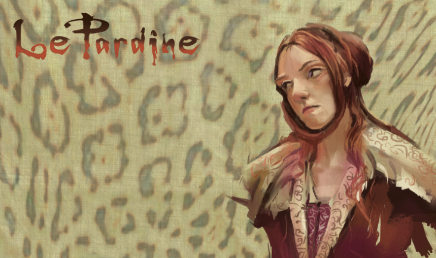


Color key exercises. The more purplish one was second (one on the right)and I used a better quality brush. It was a small bright that did everything. I've been told by a couple of really good illustrators that it did not matter if they used an expensive brush or a "throw away". But here's the difference; right painting is definitely more exciting than the other. A better quality brush does perform much better at least for me.
No comments:
Post a Comment