Dawn!
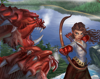
This is the second fantasy illustration in a story telling series. This is the second full illustration I have done in Photoshop and yes, you can say I bit off more than I could chew..
Self critique:
What did I learn?
I need to work on:
-Overall consistency. I think that is true for most digital illustrators because the tools are so varied and there are so many choices.
-Getting better at color mixing, badly, badly needed here, too much black over all!
-Better management of files, organizing, layering, etc
-Push for better lighting
-Getting to know my digital brushes, picking my favorite ones and using them for better overall consistency
-Work more abstractly first, before the form
It was only towards the very end I felt I was finally painting a little in Photoshop. When I first began the color/value lay out on this, looking back on it I should have layed everything out in pure color-not a gray scale layout. Color should have been addressed first, because there is too much black, not enough warms and cools playing off each other. I learned this while painting the small plein aire color sketches in Tahoe (see earlier posts)

No comments:
Post a Comment