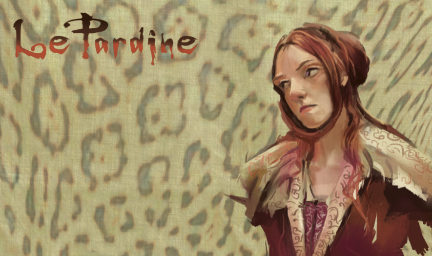

It's truly depressing on how crappy these scans are this weekend...the colors in this painting are beautiful; some of the most sophisticated I've done in my color journal. The trick is to do as many different color and lighting variations as I can. These are Nagel colors; almost all colors are mixed from a color base of Thalo green and Aliz Crimson. Lovely greys and crisp blacks. What I missed is the weariness and sorrow on her face...She looks a lot like my paternal grandmother.
I was working from a bad jpeg and the colors were very uneventful and desaturated. But the good thing was that it was totally open to color interpretation and thus I was free to explore what type of neutrals I wanted. Because of it's lack of focus on saturated color, I punched up the cool reds under the chin, which totally made an otherwise dull pic into a more livelier one.
No comments:
Post a Comment