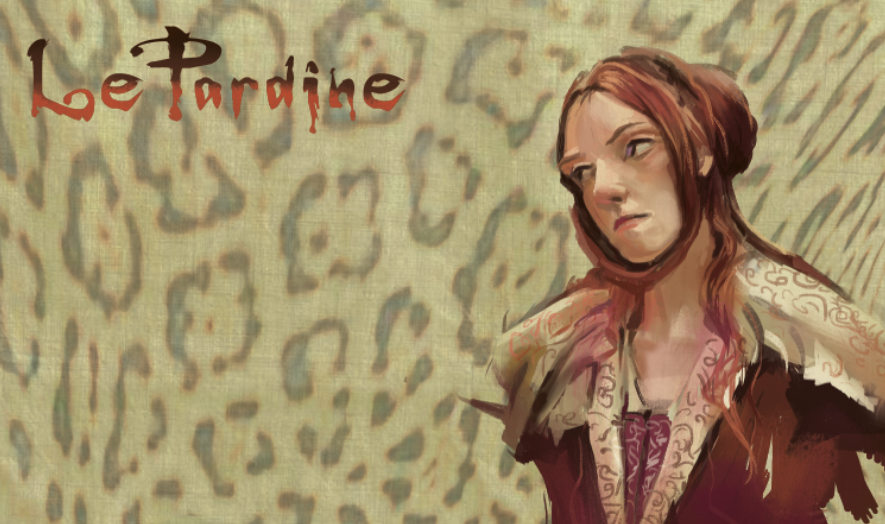
More like it...I started adding some pinks and fuschias, colors that I have never worked with before. (On my last trip to Europe, I was in Prague and went to the Alphonse Mucha Museum and bought this chocolate bar with his print on it. The predominate color was reds and tones of reds and that inspired the color choice of this illustration). This illustration is about the splendor of Spring, in all it's breath taking and long awaited metamorphisis. I am in the midst of a divorce and this illustration...well...it's a gift to myself. The Buddhist saying is "There was never a Winter without a Spring" and now, it's my Spring. Enough of that...
You can see how well the colors are mixing now that all that black is gone. And that's how it would really be in Nature. I love the color of the background. I love grey. My friends probably think I'm crazy because, yes, I do wear a lot of neutral colors. But you see, pure saturated colors pop off a neutral gray; when I paint traditionally, I mix my colors against a grey palette. I'll never paint without that. It's a tablet of small sheets of grey called Grey Matters Paper Palette (Jack Richeson & Co. Inc) and what works with traditional will work with digital.
Now that I've already worked out a drawing I really like, have a "schematic" for my lights and darks (which I refer to all the time to make sure I capture the original intent of the black and white and I do have that version up all the time to reference when I apply the color), all I have to do is choose my saturated color shadows and continue to render everything in color. I know better what to expect and the illustration does not "run away from me" because I am wrestling with everything all at once.


No comments:
Post a Comment