New Flag

New Flag
Red Head

Monday, July 11, 2011


Took a trip to the Bay Area and back. Painted these at the Mother-In-Law's house. Both hardly took time at all. You can see the casualness of the brushstrokes, confidence building. I'm getting to a point where I know where to stop and how to address the over all picture in a consistent manner. I work the entire image then focus on the areas I want to suggest a little more selective detail. But it takes experience, I'm finding, restraining oneself to a level that the painting reads well and does not need to have anymore done with it and still looks good. Do not over bake, do not overcook, so to speak; put the brush down; you are done; etc.

Tuesday, July 05, 2011


Chuck, Arnel, Michael, John, Helen, Kelly, Ravenstone, and Miller, thank you for signing up as followers. You guys rock! I am filled with gratitude! Keep drawing, painting, creating and reach for stars!

Kim

Sunday, July 03, 2011


Spent way too much time on this. Another bad scan; the original looks so much better. You have to have good drawing skills for this one. Viggo's chiseled face was so much fun to paint!

Saturday, July 02, 2011


Beginnings.

10 minute block in from remaining pallette. Still even looser. Will try to get back tomorrow. Gotta help with dinner now..

Return to this great looking fellow. I'm going to try to get more shots of him; he's just delicious to paint. Feeling more confident; color mixing really coming along and I am learning to trust myself more; dragging the brush now!

Roughly 5 1/2" x 4" on thick moleskin paper (bound sketch book), acrylic. Had started blocking this one in a few days ago, finished it today. A little over an hour total. Pure joy.

Sunday, June 26, 2011


More from Hidalgo. Loved, loved this woman's costume. I'm a sucker for that turn of the century look. Loved the peacock feathers below the shoulders and her playful green jeweled necklace which hung at her throat. Too bad the light was so low you did not get to see much of the dress...wah! Spent way too much time on the upward shot, difficult angle. She was more attractive in the shot, but I did get her expression and I would rather get the expression than the likeness...

Saturday, June 25, 2011


First pass: 25 minutes, big bold brush strokes.
One hour later...

And so help me, I so want to start another; reaching for the masking tape...

Sunday, June 19, 2011


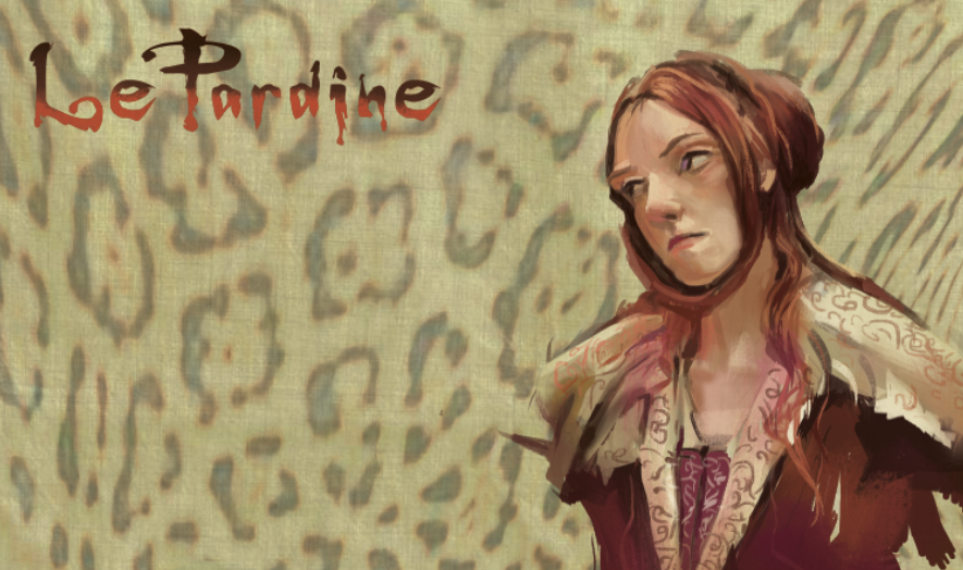
Yesterday, painted like ka-rap..today I could do no wrong. I'm going to blame it on...hormones. A revisit to Hidalgo~finally got a program which will allow me to take DVD snap shots!! Yeah! Don't have to rely on poorly chosen screenshots from the internet anymore! This is how I envision LePardine will be painted~both traditionally as well as digitally.

Another leap actually in achievement; one of the best entries so far.

Saturday, June 18, 2011


Photoshop is so fun. Stretched the drawing just slightly to elongate the face. Methinx I like this version better...

Husband, child, gone for a few hours tonight. Solitude. Heaven.

Drawing overlay from a thumbnail sketch (bottom left).

Friday, June 10, 2011


WIP:

Almost, almost done. Will be heading out of town this weekend, so I will have to back to this next week. Now for a frame...

Tuesday, May 31, 2011


One more from "Mongol". Desaturated palette. Love, love, love the lighting in this one.

Monday, May 30, 2011


Thru a good twist of events, everyone left today and I got a rare few hours alone. From the movie, "Mongol". A pretty unsaturated palette, few cadmiums, grey sky; in the peace and quiet, actually got to hear myself think uninterrupted, got to linger and love this one little. 2 hours +

This was actually done yesterday. Lots of saturated cadmiums in this one. Had gone to Chinatown with my dad and his sister the day before, maybe influenced by the trip?

Sunday, May 22, 2011


The King's Speech

Was watching the movie and came upon this great face during the last part of the film. This older gentleman had such character, he seemed almost like a caricature. I did not capture how weathered he was, but I loved the colors~I used my new Quinacridone Blue Violet for the darkest skin tones in shadow. It worked perfectly for this; while not an exciting color right out of the tube, it is desaturated enough to give me a more "muddier" skin tone. (For those of you not familiar with painting with acrylics, it is hard to control it's brilliance.) I also used a new brush~Grumbacher Gainsborough 1271 flat #4 bristle brush, which is scary to use because you have no control. I loaded the brush with paint and went for it. I actually had to repaint the face all over again, since I did not like the first try. But because this brush was so bristly (I think it's a canvas brush), it gave me a wonderful random performance, yeah, you probably think I did the brushwork on purpose...I got lucky. This, I think, is my best entry in my color journal as yet! :)

Saturday, May 21, 2011


More from the King's Speech~
Helena Bonham Carter as Your Royal Highness~ quoth: "I don't have a hubby, we don't 'pop', and you will have to come to us!" to Geoffrey Rush, as Lionel Logue.

Struggling with the lowkey, unsaturated pallette. There are not a lot of cadmiums, just Orange Cad hue, and Red cad light. I think I had hit a high with the Vincent Price painting and feel like I am starting all over again. Been hit with a bit of melancholia and I mention this because it comes with the territory of being a creative, but fortunately for me it never lasts for very long.

On a better note, I ordered several tubes of paint from Dick Blick catalog, which had a 49% off sale! Don't know if it is still going on, but I made out like a bandit! Bought a new color, Quinacridone Blue Violet, which I can't wait to take it for a spin hopefully soon!

And a warning to those who want to try my paints when they see me whip out my pallette~I let my daughter use them and she switched the Titanium White tube cap with the Burnt Umber~my white is now contaminated with brown; my brown now looks like mocha...Grrr I am very protective about my tools!

Friday, May 20, 2011


I've just finished a run of nearly 2 months constant work, no weekends and I feel burned out~and it shows in these works. I finally got to sit down and watch a movie The King's Speech. I loved the cool colors in this film, the thalos, blue and green and the cool flesh tones.

Wednesday, May 11, 2011


Horses Taught Me to Draw

Some rough sketches for a project I am working on. I grew up drawing horses. I read every horse story for girls there was, Black Beauty, The Black Stallion, etc. My parents bought me Breyer horses for my birthday and Christmas. I drew them from all angles and so drawing horses come as natural as breathing to me. For a long time, I wondered why I could not draw the figure like I could draw animals and sometimes when I get a block, I will draw a horse to get my brain flowing again. I will forever have this Visual Imprint of a 3 dimensional model horse in my brain. People ask me all the time, How do you learn to draw animals so well? If you want to really learn, you sculpt the animal. I have been working on a sabor tooth cat sculpt which will give me that Visual Imprint.

Sunday, May 08, 2011


I picked this pic because it offered weird color choices. The hair is diox purple, thalo blue and burnt sienna; a terrific color combo which gave me a striking contrast to the warm desaturated olive background. No saturated colors anywhere, all neutrals. Love neutrals. Real quick~20 minutes, if that. Small, maybe 3" x 2 1/2" in my moleskine Color Journal, acrylic. It's a Happy Mother's day gift for myself!

Thursday, April 28, 2011


Practicing restraint~I could have gone on and on with this one. I could have easily over done it, but forced myself to stop when everything I wanted to say was there. It's all there..Quickie~fastest yet...20 minutes? Vincent Price~I love Vincent Price, such a classy actor. A+++ for brushwork, yes now we are getting somewhere, good values, good warms, cools, good neutrals.

Sunday, April 24, 2011


It's truly depressing on how crappy these scans are this weekend...the colors in this painting are beautiful; some of the most sophisticated I've done in my color journal. The trick is to do as many different color and lighting variations as I can. These are Nagel colors; almost all colors are mixed from a color base of Thalo green and Aliz Crimson. Lovely greys and crisp blacks. What I missed is the weariness and sorrow on her face...She looks a lot like my paternal grandmother.

I was working from a bad jpeg and the colors were very uneventful and desaturated. But the good thing was that it was totally open to color interpretation and thus I was free to explore what type of neutrals I wanted. Because of it's lack of focus on saturated color, I punched up the cool reds under the chin, which totally made an otherwise dull pic into a more livelier one.

Saturday, April 23, 2011


Been really, really busy, had some time today, busted this out. I was rusty; took me over an hour and I struggled but the highlighted area on the scalp came out better than I imagined. The colors mixed well, my favorite part of the painting. I miss traditional painting and it's randomness. Been doing a lot of digital work lately and I love that too.

Moleskin color journal, acrylic on paper, roughly 5" x 4".

Thursday, March 24, 2011


Pirates of the Carribean~
This one will be the last post in this series for a few weeks...I've got real work to attend to for now. Back to sunlight and to the beach! I love beachy scenes! Wonderful opportunity to paint a wonderful medley of earthtones in the clothes and to play with brush strokes. Used a tiny filbert brush for skirt. Never saw this movie. Rush job; unfinished, being called away to...responsibilities now..sigh...

WHY THIS WORKS:
The background is the most saturated with color and the lightest value, which is a contrast to the figures who are mostly dark neutrals with sparks of diluted saturated color. In most of the pictures I have worked on, the figures tend to be the most saturated and lit up with light and the background is dark and desaturated.

NEW BLOGGER!
John Quinn got me blogging (March 2006!) and so I continue to carry the torch. My friend KC will be posting photography from a disposable camera every week! Visit his site~see my list of blogs to the right and thank you for taking a peek. kcdurkin-kcdurkin.blogspot.com

Wednesday, March 23, 2011


This one was a tough one. No real center of focus, no saturated colors; infact, I think this film was shot kinda dark. I concentrated on the soft neutrals, practicing a several figures in the background sort of thing, an opportunity to abstract the colors into harmonious color. Faces were so small, I could not get the apprehensive expressions. And to top things off, the tape rips off part of the painting! Gotta find a better tape. Also I found this still on the internet. Why does not anyone take better screen shots to promote a movie?? I'll stop whining now!

Tuesday, March 22, 2011


The Fearsome Maugua from The Last of the Mohicans
I loved this film. Here the local colors are Thalo green (also predominate in background) and Red Oxide (flesh). The other natives in the background are color derivatives from Maugua, maybe a little more thalo to dilute the red oxide or tinted with a little more titanium white. Took a little more time to mix a more harmonized color pallette on the right.

Pretty quick; maybe 30 mins. Unfortunately, the darks scanned as black; there is no true "black" in this picture. The darkest flesh tones are burnt umber + thalo green + maybe a touch of red oxide.

Monday, March 21, 2011


Change of pace~from the film "Hildago"

A return back to my beloved earth colors and bright sunlight! Got a little more abstract on this one and this is the direction I want to turn to more often. Love the new brushes! Black people are so frickin' fun to paint~so many colors found in the faces, purples, blacks, oranges, blues etc, and this man was gorgeous to paint, was killed off too early in the movie for me. Beautiful character to watch.

Roughly 4" x 3" on paper (in my Color Journal sketch book), acrylic.

Sunday, March 20, 2011


Scheming to take the Crown (boy, does this movie make us gals look bad!)

These are the steps~
When I begin, the painting actually looks terrible. It's amazing what I end up with, tho. I'm thinking about the neutrals and how I can use them to make the more pure colors pop, which is hard to control with acrylics. This one took roughly an hour because there are two figures. Natural light from a window~one of my favorite light conditions. I'm also thinking about how to organize the brush strokes and just what brush to use for the best effect.

A little melancholia today; being a creative it comes with the territory. Painting or creating helps lift the cloud a little...

Saturday, March 19, 2011


Small break this weekend, had 40 minutes to bang this out, took 5 min to set up paints, 30 minutes to slap color on, 5 min to clean up, then head out to Cal State Fullerton to see Kim Dwinell's Grad Show on Surfsidegirls.com! Beautiful watercolor art! So proud of you, Other Kim!!

I managed to catch Eric Bana's Oh man, what have I got myself into? expression. I have not painted this type of lighting before where there is no direct strong sunlight, but am eager to begin painting all types of light. Also I hate rushing so much that I can't even do a better job with the color palette on the right. Need to spend more time on the mixing neutrals. The last 2 weeks have been rush here, rush there, need time to take a breath and be more deliberate! OK, I'll stop whining now!

Thursday, March 10, 2011


I believe this is when Ann triumphantly returns to court to entice King Henry the 8th into marriage...and dumping his Spanish wife.

I concentrated on nuetrals or "mud colors" and punched it up with a lighter value and saturated color accents. I had once asked fantasy artist guru, Greg Manchess, how you handle something with this much detail and he said to "mass it." So I created several neutral grays into one general shape, then added the color accents~I treated the whole as a color abstract.

Okay, boys and girls, I have to go and make some money...will continue this series when I get a break! Thank you all for checkin' in!

Wednesday, March 09, 2011


Eric Bana as King Henry the 8th. He has this glazed look in this screen shot. It may be that he has just gotten rid of his first wife to acquire Ann Boleyn and has just realized what he is in for when he learns that Ann will do anything to be Queen...but I could have it wrong since it's been awhile since I've seen the movie. My biggest complaint about this film was that they had spent money on the gorgeous costumes, great location...and had just about no reflective lighting so that everything got dark and dropped into mud...it sucked a lot of the pleasure of viewing the film for me...

This one took about 30 minutes.

Tuesday, March 08, 2011


And painted just now...


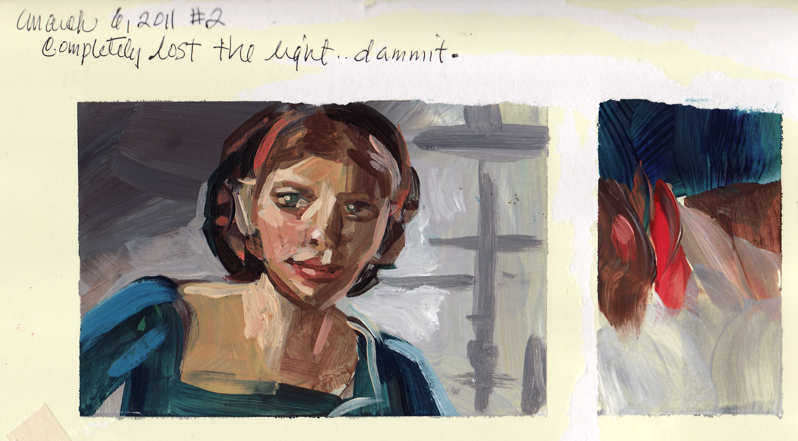
These were done for Nathan Fowkes color workshop.
This is what I learned:
Warm temperatures vs. cool
Saturated color vs. Nuetrals

These are posted in the order I painted them; the top one being the first, ending with the two Boleyn sisters at the bottom. They are roughly 4"x 3", small, acrylic, scans not capturing the power of the originals of course. (Could you tell that husband and child were out of town when I did these?) I also bought better brushes and are getting to know them intimately~what I like and what lends itself to my personal taste and style.

Nathan says that "Great colorists are not born; you develop great color by practice and more practice." He has done a small painting a day for several years, starting with copying every single painting from a western book of paintings and he is simply one of the best colorists I know. (I prefer taking screenshots of movies particularly period films in which there are great examples of natural light and costume. By doing this, I can also get an understanding of how the story is staged, lit, how the director thinks). I also took note that he has two sets of some of the same colors~so that one set gets mixed and muddied and he still has a reservoir of clean saturated color to grab from and he has two containers to rinse his brushes, so he can get a cleaner rinse the second time. (He used gouache in class) He is also very picky about how saturated with water his brushes are. I have never seen anyone who does any of these things. Along with a masterful understanding of color, he has a great feel for brush stroke, two powerful advantages. (See his blog: http://nathanfowkes-sketch.blogspot.com) He told me, Kim, if you do a small painting a day, you will be a great colorist too. Nathan, you just handed me the Keys to the Kingdom. I highly recommend for any artist to take his color workshop. Thank you, Nathan, for sharing your knowledge!

Saturday, March 05, 2011


No, I have not dropped off the face of the planet...just have a small break this weekend; was getting down because I have not had the time to jump on my own projects. Was going thru some drawings and found these. I had done these during a lunch break at MGA a while ago which had inspired me to make a sculpt (older post). I like bits and parts of these drawings and the central drawing is a young animal as you can see how thin the stomach area is. In a very youthful cat developing into maturity, (and this is prominent in humans as well), drawing a lean abdominal area instantly gives us the visual clue that this is a young animal. To emphasize and de-age the animal even more, I could have exaggerated the size of the paws to make it into an adolescent. I like this drawing because the lines really feel right; anatomy and muscles are working.

KUDOS!
Several years ago, I met Kim Dwinell at Disney Feature Film. She was like me, tiny, lively, a bright flame of energy. In our emails, she refers to me as "The Other Other Kim" (O.O.K), while I affectionately call her "The Other Kim". Flash forward a few years and she says we should think about creating our own graphic novel, thus concepts for LePardine were penned and Other Other Kim creates "Surfsidegirls.com". Check it out! She is much more on her way than I am, but I will get there. I am so proud of you, O. K., can't wait to read more and buy the novel!