New Flag

New Flag
Red Head

Sunday, June 26, 2011


More from Hidalgo. Loved, loved this woman's costume. I'm a sucker for that turn of the century look. Loved the peacock feathers below the shoulders and her playful green jeweled necklace which hung at her throat. Too bad the light was so low you did not get to see much of the dress...wah! Spent way too much time on the upward shot, difficult angle. She was more attractive in the shot, but I did get her expression and I would rather get the expression than the likeness...

Saturday, June 25, 2011


First pass: 25 minutes, big bold brush strokes.
One hour later...

And so help me, I so want to start another; reaching for the masking tape...

Sunday, June 19, 2011


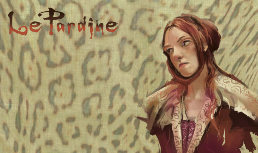
Yesterday, painted like ka-rap..today I could do no wrong. I'm going to blame it on...hormones. A revisit to Hidalgo~finally got a program which will allow me to take DVD snap shots!! Yeah! Don't have to rely on poorly chosen screenshots from the internet anymore! This is how I envision LePardine will be painted~both traditionally as well as digitally.

Another leap actually in achievement; one of the best entries so far.

Saturday, June 18, 2011


Photoshop is so fun. Stretched the drawing just slightly to elongate the face. Methinx I like this version better...

Husband, child, gone for a few hours tonight. Solitude. Heaven.

Drawing overlay from a thumbnail sketch (bottom left).

Friday, June 10, 2011


WIP:

Almost, almost done. Will be heading out of town this weekend, so I will have to back to this next week. Now for a frame...

Tuesday, May 31, 2011


One more from "Mongol". Desaturated palette. Love, love, love the lighting in this one.

Monday, May 30, 2011


Thru a good twist of events, everyone left today and I got a rare few hours alone. From the movie, "Mongol". A pretty unsaturated palette, few cadmiums, grey sky; in the peace and quiet, actually got to hear myself think uninterrupted, got to linger and love this one little. 2 hours +

This was actually done yesterday. Lots of saturated cadmiums in this one. Had gone to Chinatown with my dad and his sister the day before, maybe influenced by the trip?

Sunday, May 22, 2011


The King's Speech

Was watching the movie and came upon this great face during the last part of the film. This older gentleman had such character, he seemed almost like a caricature. I did not capture how weathered he was, but I loved the colors~I used my new Quinacridone Blue Violet for the darkest skin tones in shadow. It worked perfectly for this; while not an exciting color right out of the tube, it is desaturated enough to give me a more "muddier" skin tone. (For those of you not familiar with painting with acrylics, it is hard to control it's brilliance.) I also used a new brush~Grumbacher Gainsborough 1271 flat #4 bristle brush, which is scary to use because you have no control. I loaded the brush with paint and went for it. I actually had to repaint the face all over again, since I did not like the first try. But because this brush was so bristly (I think it's a canvas brush), it gave me a wonderful random performance, yeah, you probably think I did the brushwork on purpose...I got lucky. This, I think, is my best entry in my color journal as yet! :)

Saturday, May 21, 2011


More from the King's Speech~
Helena Bonham Carter as Your Royal Highness~ quoth: "I don't have a hubby, we don't 'pop', and you will have to come to us!" to Geoffrey Rush, as Lionel Logue.

Struggling with the lowkey, unsaturated pallette. There are not a lot of cadmiums, just Orange Cad hue, and Red cad light. I think I had hit a high with the Vincent Price painting and feel like I am starting all over again. Been hit with a bit of melancholia and I mention this because it comes with the territory of being a creative, but fortunately for me it never lasts for very long.

On a better note, I ordered several tubes of paint from Dick Blick catalog, which had a 49% off sale! Don't know if it is still going on, but I made out like a bandit! Bought a new color, Quinacridone Blue Violet, which I can't wait to take it for a spin hopefully soon!

And a warning to those who want to try my paints when they see me whip out my pallette~I let my daughter use them and she switched the Titanium White tube cap with the Burnt Umber~my white is now contaminated with brown; my brown now looks like mocha...Grrr I am very protective about my tools!
Friday, May 20, 2011


I've just finished a run of nearly 2 months constant work, no weekends and I feel burned out~and it shows in these works. I finally got to sit down and watch a movie The King's Speech. I loved the cool colors in this film, the thalos, blue and green and the cool flesh tones.

Wednesday, May 11, 2011


Horses Taught Me to Draw

Some rough sketches for a project I am working on. I grew up drawing horses. I read every horse story for girls there was, Black Beauty, The Black Stallion, etc. My parents bought me Breyer horses for my birthday and Christmas. I drew them from all angles and so drawing horses come as natural as breathing to me. For a long time, I wondered why I could not draw the figure like I could draw animals and sometimes when I get a block, I will draw a horse to get my brain flowing again. I will forever have this Visual Imprint of a 3 dimensional model horse in my brain. People ask me all the time, How do you learn to draw animals so well? If you want to really learn, you sculpt the animal. I have been working on a sabor tooth cat sculpt which will give me that Visual Imprint.

Sunday, May 08, 2011


I picked this pic because it offered weird color choices. The hair is diox purple, thalo blue and burnt sienna; a terrific color combo which gave me a striking contrast to the warm desaturated olive background. No saturated colors anywhere, all neutrals. Love neutrals. Real quick~20 minutes, if that. Small, maybe 3" x 2 1/2" in my moleskine Color Journal, acrylic. It's a Happy Mother's day gift for myself!

Thursday, April 28, 2011


Practicing restraint~I could have gone on and on with this one. I could have easily over done it, but forced myself to stop when everything I wanted to say was there. It's all there..Quickie~fastest yet...20 minutes? Vincent Price~I love Vincent Price, such a classy actor. A+++ for brushwork, yes now we are getting somewhere, good values, good warms, cools, good neutrals.

Sunday, April 24, 2011


It's truly depressing on how crappy these scans are this weekend...the colors in this painting are beautiful; some of the most sophisticated I've done in my color journal. The trick is to do as many different color and lighting variations as I can. These are Nagel colors; almost all colors are mixed from a color base of Thalo green and Aliz Crimson. Lovely greys and crisp blacks. What I missed is the weariness and sorrow on her face...She looks a lot like my paternal grandmother.

I was working from a bad jpeg and the colors were very uneventful and desaturated. But the good thing was that it was totally open to color interpretation and thus I was free to explore what type of neutrals I wanted. Because of it's lack of focus on saturated color, I punched up the cool reds under the chin, which totally made an otherwise dull pic into a more livelier one.

Saturday, April 23, 2011


Been really, really busy, had some time today, busted this out. I was rusty; took me over an hour and I struggled but the highlighted area on the scalp came out better than I imagined. The colors mixed well, my favorite part of the painting. I miss traditional painting and it's randomness. Been doing a lot of digital work lately and I love that too.

Moleskin color journal, acrylic on paper, roughly 5" x 4".

Thursday, March 24, 2011


Pirates of the Carribean~
This one will be the last post in this series for a few weeks...I've got real work to attend to for now. Back to sunlight and to the beach! I love beachy scenes! Wonderful opportunity to paint a wonderful medley of earthtones in the clothes and to play with brush strokes. Used a tiny filbert brush for skirt. Never saw this movie. Rush job; unfinished, being called away to...responsibilities now..sigh...

WHY THIS WORKS:
The background is the most saturated with color and the lightest value, which is a contrast to the figures who are mostly dark neutrals with sparks of diluted saturated color. In most of the pictures I have worked on, the figures tend to be the most saturated and lit up with light and the background is dark and desaturated.

NEW BLOGGER!
John Quinn got me blogging (March 2006!) and so I continue to carry the torch. My friend KC will be posting photography from a disposable camera every week! Visit his site~see my list of blogs to the right and thank you for taking a peek. kcdurkin-kcdurkin.blogspot.com