New Flag

New Flag
Red Head

Thursday, December 30, 2010

HOME ALONE FOR THE HOLIDAYS and lovin' it

I've always wanted to do a anime based illustration. Here is a rough done by ball point pen. Solitude...I am so much more productive when I be alone..I wait all year for this time...

Friday, December 17, 2010


Check it out! New Blogger!

I met Michael LaRue thru my husband at Starbucks Coffee. I told him about the importance of blogging~and I must have been pretty persuasive because he listened to me! Not only that, but he brings a sketchbook with him everywhere he goes! Which leads me to my next rant: ALWAYS CARRY A SKETCHBOOK WITH YOU! I usually have 2 sometimes 3. I will carry one for just sketching with a pen and sometimes a small sketch tablet which can handle both pencil and watercolor. And yes, I do carry a small watercolor kit with me. DRAW EVERYDAY; anything that interests you. Michael is taking this to heart, which means he will improve tremendously for as long as he carries and uses that sketchbook. You go, Michael!

Thursday, December 09, 2010


Feed the Blog:
Been ultra busy with paid projects..trying to squeeze in some personal drawing time. For all you artists and budding artists out there, start a blog! I can't tell you how important this is to be out there on the internet! Most people don't want the obligation, and yes, you do have to feed your blog monthly! BUT you will improve and that will generate more jobs! Okay, enough with the lecture!

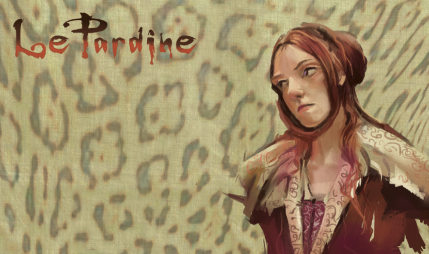
Onto notes for LePardine:
the big cats, Sulee and Luna are so proportionately overwhelming, that I faced them away from the viewer, eyes closed or half closed so that you can focus on the main character, LePardine. We see only her direct look. When I sketched the layout, the cats were so overwhelming, it was important that the story was not about them...and I can see this becoming a challenge as I get more into the art. I've done enough character art to know which character will be the "star" and how to emphasize that on the pose, or gesture. My natural style of drawing is realistic and when I started in the animation industry, it was like learning to draw all over again. I learned the anatomy and the technical stuff first before the emoting thru the drawing so it threw me. But LePardine will be a mix of an animation style, traces of animae, esp. in the eyes and part realistic rendering. She was designed for painting and a quick brush style, traditional or digital. And she is fun, fun, fun to draw!

Wednesday, November 24, 2010


Rough drawing of composition. Next will be the clean line drawing, then onto the paint! Been trying to post this but my internet access was down the last 24 hours. Arghh! Technology!

Tuesday, November 16, 2010


Working On the color...will get the drawing squared away before the final paint...

Sunday, November 14, 2010


...Which was inspired by this ruff sketch with pen

Working on this right now. It's for a contest called "Flight" and its due today at 5! I've decided to work a little bit different this time; with pen and ink for the concept sketch, and drawing/painting right on the wacom. Usually I just do the paint on the wacom but I will use the pen tool for most of the shapes, this time it's more freehand. Not a great piece of artwork; just more practice on technique.

Sunday, November 07, 2010


Some character exploration for Sulee and Luna. Playing with expressions and face shapes. Trying to get as much done as I can before the Holidays get here.

Friday, October 29, 2010


In the Ruff:


One of the first definitive drawings of LePardine. I still need to put the second Snow Cat on the left. She will be reminiscent of an Anime style. Then I need to zero in on the type of light I want. I may go for a semi shadow with a strong back rim light...maybe. People are so impressed that I am so self motivated as busy as I am. But I ask them, how can you not? It's so much freakin' fun to draw, to create, to dream. Friends have been suggesting changing "LeoPardine" to "LePardine." What do you think? Remember this will eventually become a graphic novel for girls. Right now I am working on a Halloween costume for my daughter and I for a party this weekend...

Sunday, October 17, 2010


Pet

I'm doing this for a friend who says that her friend's dog died. She was poisoned by someone. Her friend was going to go to an animal portrait artist who charged a lot of money, but I said let me do it. Pro Bono. It has been such a wet day that the paints (acrlylic) took their time in drying so I ended up painting wet on wet, which is something I don't normally do. I suppose that's how it feels to paint with oils and the underpainting looked like a wet oil.

I used to paint a lot of animals in miniature back in the day and then, it was the most striking work I did. (This is not a miniature.) Since then, I got married, had a child, and the ol eyesight is not what it used to be. Back then I really had no real responsibilities and was not interrupted every five minutes and I think I had had more sleep and a steadier hand. But at this age, I must admit, I make better decisions when creating and am more calm and relaxed and deliberate. Age does has its advantages. I will post this again when I am finished.


Painting in Process:

Much better on this one. More to go, loving those purples and oranges again...


Roccoco object from the Getty.


More images from the Getty; same picture.

Saturday, October 09, 2010


I tend to love the Neo-Classic stuff; always have since a teenager. I also love the ceramic Jesus, which was not a real great piece in itself, but photographed beautifully, even with a crappy cell phone. An image which may be painted in the future.
I could not get over how realistic the tiger fur was; you could almost reach out and touch it. I don't think it was an Alma-Tadema like the one at the bottom but within that genre. The Alma-Tadema was mindblowing.


I have more images, but for some reason, Blogger will not let me post them...:(
The image at the top must have been painted with a single hair brush in the final details. Beautiful clarity in painting execution; every detail in sharp focus. The middle painting was of course a Sargent, but not a great Sargent example. I thought the most interesting part was the hand. Then there was a sumptious cat which was very buttery; the portrait of the woman itself was not as fresh nor inspired.


I went to the Getty Center yesterday with a friend. I apologize about the quality of the photos; I took them with my phone camera. I am looking for a few things: Real paintings with real paint strokes. Particularly interested in how painters dealt with several figures in a picture to tell a story and having the story still read clearly. I have been painting several figures in a background (digitally) for a client and am learning how to simplify the story in terms of light, or warm and cool colors. I am also looking at the paintings as abstract colors.

Sunday, September 19, 2010


Threw away my black, my earth colors and went for the primaries and secondaries. This one is a little bigger than the rest, about 8.5 x 6' acrylic on canvas paper. This was a lion bronze, a part of a bigger sculpt at the Huntington Gardens.

Having a love affair with thalo blue, diox purple and cad red light and magenta and violets.

Monday, September 13, 2010


I have been taking a lot of thumbnail pics from my phone and using them to practice with color mixing in acrylic on canvas paper. I was trying to do a small painting a day, but there is no way I can find time to do this.

Got rid of black and earth colors from my palette for now.

Thursday, September 02, 2010


Quickies
Some quick color studies. This one roughly 3 1/2 by 3 1/2 inches. Focusing on warm cool color relationships. This will help me color mix in digital. Acrylic on canvas paper.

Tuesday, August 17, 2010


Dawn!
This is the second fantasy illustration in a story telling series. This is the second full illustration I have done in Photoshop and yes, you can say I bit off more than I could chew..

Self critique:

What did I learn?

I need to work on:
-Overall consistency. I think that is true for most digital illustrators because the tools are so varied and there are so many choices.

-Getting better at color mixing, badly, badly needed here, too much black over all!

-Better management of files, organizing, layering, etc

-Push for better lighting

-Getting to know my digital brushes, picking my favorite ones and using them for better overall consistency


-Work more abstractly first, before the form

It was only towards the very end I felt I was finally painting a little in Photoshop. When I first began the color/value lay out on this, looking back on it I should have layed everything out in pure color-not a gray scale layout. Color should have been addressed first, because there is too much black, not enough warms and cools playing off each other. I learned this while painting the small plein aire color sketches in Tahoe (see earlier posts)

Tuesday, August 10, 2010


Last Day at Eagle Falls, Tahoe
I got up at 4 am to get to Eagle Falls by 6 to see the sun rise. What a morning. I couldn't decide on whether to climb the falls down to Emerald Bay or paint. I did a little of both.

Eagle Falls is one of my favorite places period. Nothing compares to it's beauty, so casual and abundant. No one was there that morning. I decided to paint small, simplify, getting better on using a system of brushstrokes, brights and filberts, getting to know them better and of course being more abstract.

Top upper left was the first and I nailed it.

Top upper right was the second one and I was on a narrow bridge at about 8 when tourists started to stagger in. I do not like people behind me and got real jumpy since this bridge is a very high traffic tourist area. I lost concentration and left.

Bottom left had an incredible example of a wonderful blue reflective light at the big boulder's base. I was intent on capturing that. I was getting tired about now, at 10 am. Decided not to paint anymore. A woman dropped by looking over my shoulder and started talking so much I thought she was going to tell me her life story.

Bottom Right. Then hiked all the way up to Eagle Lake carrying about 15 pounds of paints, water and lunch in high elevation, sweating and panting for breath up broken granite and an incredible path, found this lovely little composition at Eagle Lake. Had to paint it, by then it was 12. Wanted to describe the shadows with blobs of blues using a limited palette.

The Palette:
Greens: Thalo green, Chromium Oxide Green, Hansa yellow (my new favorite yellow. Ugly right out of the tube, but mixes great to get cool highlights in greens as well as wonderful warm neutrals for rock)
Sky: Colbalt turquoise (teal), cerulean blue, tit.white
Rock: Raw Sienna, Hansa yellow (like 2%), black, tit. white, chromium oxide green (like 1%) or cerulean blue (1%)

Small acrylic color sketches on 8 1/2 by 11 canvas paper

Friday, August 06, 2010


This is from Bliss Park which is right before Eagle Falls. I've always wanted to get to Bliss but always ran out of time. It's paradise here, incredibly blue, turquoise water up to blunt rocky cliffs~cliffs small enough that the local teenagers were leaping off the boulders into the icy water. My nine year old daughter took her turn and as a mom, it was hard to watch.

Acrylic on canvas paper. Taken from cell phone.

Wednesday, August 04, 2010


The last one I did yesterday-a real quickie, as Greg and Sienna were tapping their feet by this time. I hated to leave.

I did not bring a scanner so these are all taken on my cell phone.

This is on the trail of Eagle Falls on the opposite side of the highway across from the Lake. We always mean to follow the trail, exquistely beautiful as well, but my daughter gets caught up here all afternoon. A very popular spot, esp. for children, it's water is icy cold and sports shades of blues to greens. I love it here. I really wrestled with this composition because my weakness is simplifying anything. I got a lot more loose on the right side of the painting, then looked up to see Greg and Sienna wanting to leave.

I am on vacation in Lake Tahoe. My very favorite place in all the world is Eagle Falls on the lake side of the highway. This is the first acrylic painting in a long time. This is actually the setting which has inspired the home of LeoPardine. Very limited pallette, on canvas paper.

Friday, July 23, 2010


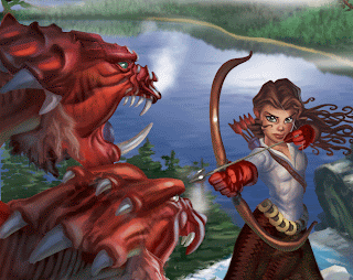
Updates while on vacation. When i can, I try to work on my file while on my laptop. Dragons filling out nicely. Top head textures are from the King Cheetah, neck and cheek textures from a mackerel.

Friday, July 16, 2010


At 6:23. It's blistering here. I took a break to jump in the pool with Greg and Sienna. Running off to Mission Viejo for a birthday party....


Updates for Archer Illustration

Tuesday, July 06, 2010


Drawings of the neighbor's dogs. It's hard being an artist and a parent at the same time. I find that I am never fully focused anymore. It's not that I can't, it's either exhaustion or Sienna screaming "Mommie! Lookit! Lookit!" Or just screaming in general; sometimes I think she's being eaten by a bear, then I think, wait a minute, there are no bears in Brad's backyard. And I just have one. I don't know how parents with multiple children handle life. In this case, as soon as I saw a good pose on the dog(s), Sienna would call them over and there goes a great pose. Sigh....

Normally I draw with my favorite prisma color pencil, Tuscan Red. Since taking Paul Wee's class on figure sketching, I have reluctantly switched to pen. These are done on a teeny little sketchbook, 4" x5", almost the size of a package of cigarettes, only big enough to make thumbnail sketches.

Thursday, July 01, 2010


Completely reworking the Archer illustration. Went back to the drawing board, creating better silohuettes, balancing values, telling the story with light. This is the underpainting.