New Flag

New Flag
Red Head

Thursday, March 24, 2011


Pirates of the Carribean~
This one will be the last post in this series for a few weeks...I've got real work to attend to for now. Back to sunlight and to the beach! I love beachy scenes! Wonderful opportunity to paint a wonderful medley of earthtones in the clothes and to play with brush strokes. Used a tiny filbert brush for skirt. Never saw this movie. Rush job; unfinished, being called away to...responsibilities now..sigh...

WHY THIS WORKS:
The background is the most saturated with color and the lightest value, which is a contrast to the figures who are mostly dark neutrals with sparks of diluted saturated color. In most of the pictures I have worked on, the figures tend to be the most saturated and lit up with light and the background is dark and desaturated.

NEW BLOGGER!
John Quinn got me blogging (March 2006!) and so I continue to carry the torch. My friend KC will be posting photography from a disposable camera every week! Visit his site~see my list of blogs to the right and thank you for taking a peek. kcdurkin-kcdurkin.blogspot.com

Wednesday, March 23, 2011


This one was a tough one. No real center of focus, no saturated colors; infact, I think this film was shot kinda dark. I concentrated on the soft neutrals, practicing a several figures in the background sort of thing, an opportunity to abstract the colors into harmonious color. Faces were so small, I could not get the apprehensive expressions. And to top things off, the tape rips off part of the painting! Gotta find a better tape. Also I found this still on the internet. Why does not anyone take better screen shots to promote a movie?? I'll stop whining now!

Tuesday, March 22, 2011


The Fearsome Maugua from The Last of the Mohicans
I loved this film. Here the local colors are Thalo green (also predominate in background) and Red Oxide (flesh). The other natives in the background are color derivatives from Maugua, maybe a little more thalo to dilute the red oxide or tinted with a little more titanium white. Took a little more time to mix a more harmonized color pallette on the right.

Pretty quick; maybe 30 mins. Unfortunately, the darks scanned as black; there is no true "black" in this picture. The darkest flesh tones are burnt umber + thalo green + maybe a touch of red oxide.

Monday, March 21, 2011


Change of pace~from the film "Hildago"

A return back to my beloved earth colors and bright sunlight! Got a little more abstract on this one and this is the direction I want to turn to more often. Love the new brushes! Black people are so frickin' fun to paint~so many colors found in the faces, purples, blacks, oranges, blues etc, and this man was gorgeous to paint, was killed off too early in the movie for me. Beautiful character to watch.

Roughly 4" x 3" on paper (in my Color Journal sketch book), acrylic.

Sunday, March 20, 2011


Scheming to take the Crown (boy, does this movie make us gals look bad!)

These are the steps~
When I begin, the painting actually looks terrible. It's amazing what I end up with, tho. I'm thinking about the neutrals and how I can use them to make the more pure colors pop, which is hard to control with acrylics. This one took roughly an hour because there are two figures. Natural light from a window~one of my favorite light conditions. I'm also thinking about how to organize the brush strokes and just what brush to use for the best effect.

A little melancholia today; being a creative it comes with the territory. Painting or creating helps lift the cloud a little...

Saturday, March 19, 2011


Small break this weekend, had 40 minutes to bang this out, took 5 min to set up paints, 30 minutes to slap color on, 5 min to clean up, then head out to Cal State Fullerton to see Kim Dwinell's Grad Show on Surfsidegirls.com! Beautiful watercolor art! So proud of you, Other Kim!!

I managed to catch Eric Bana's Oh man, what have I got myself into? expression. I have not painted this type of lighting before where there is no direct strong sunlight, but am eager to begin painting all types of light. Also I hate rushing so much that I can't even do a better job with the color palette on the right. Need to spend more time on the mixing neutrals. The last 2 weeks have been rush here, rush there, need time to take a breath and be more deliberate! OK, I'll stop whining now!

Thursday, March 10, 2011


I believe this is when Ann triumphantly returns to court to entice King Henry the 8th into marriage...and dumping his Spanish wife.

I concentrated on nuetrals or "mud colors" and punched it up with a lighter value and saturated color accents. I had once asked fantasy artist guru, Greg Manchess, how you handle something with this much detail and he said to "mass it." So I created several neutral grays into one general shape, then added the color accents~I treated the whole as a color abstract.

Okay, boys and girls, I have to go and make some money...will continue this series when I get a break! Thank you all for checkin' in!

Wednesday, March 09, 2011


Eric Bana as King Henry the 8th. He has this glazed look in this screen shot. It may be that he has just gotten rid of his first wife to acquire Ann Boleyn and has just realized what he is in for when he learns that Ann will do anything to be Queen...but I could have it wrong since it's been awhile since I've seen the movie. My biggest complaint about this film was that they had spent money on the gorgeous costumes, great location...and had just about no reflective lighting so that everything got dark and dropped into mud...it sucked a lot of the pleasure of viewing the film for me...

This one took about 30 minutes.

Tuesday, March 08, 2011


And painted just now...


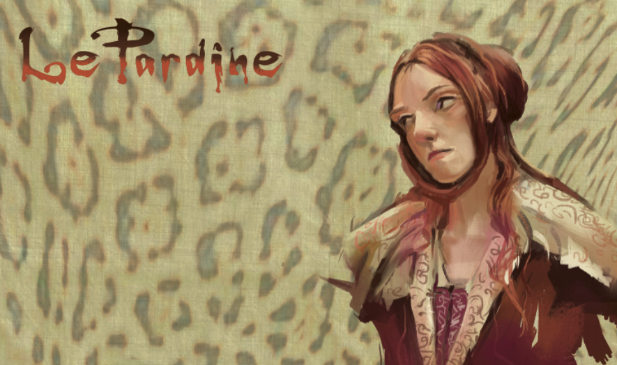
These were done for Nathan Fowkes color workshop.
This is what I learned:
Warm temperatures vs. cool
Saturated color vs. Nuetrals

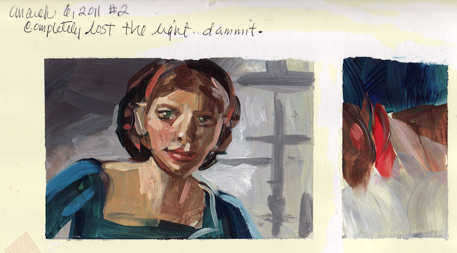
These are posted in the order I painted them; the top one being the first, ending with the two Boleyn sisters at the bottom. They are roughly 4"x 3", small, acrylic, scans not capturing the power of the originals of course. (Could you tell that husband and child were out of town when I did these?) I also bought better brushes and are getting to know them intimately~what I like and what lends itself to my personal taste and style.

Nathan says that "Great colorists are not born; you develop great color by practice and more practice." He has done a small painting a day for several years, starting with copying every single painting from a western book of paintings and he is simply one of the best colorists I know. (I prefer taking screenshots of movies particularly period films in which there are great examples of natural light and costume. By doing this, I can also get an understanding of how the story is staged, lit, how the director thinks). I also took note that he has two sets of some of the same colors~so that one set gets mixed and muddied and he still has a reservoir of clean saturated color to grab from and he has two containers to rinse his brushes, so he can get a cleaner rinse the second time. (He used gouache in class) He is also very picky about how saturated with water his brushes are. I have never seen anyone who does any of these things. Along with a masterful understanding of color, he has a great feel for brush stroke, two powerful advantages. (See his blog: http://nathanfowkes-sketch.blogspot.com) He told me, Kim, if you do a small painting a day, you will be a great colorist too. Nathan, you just handed me the Keys to the Kingdom. I highly recommend for any artist to take his color workshop. Thank you, Nathan, for sharing your knowledge!


Saturday, March 05, 2011


No, I have not dropped off the face of the planet...just have a small break this weekend; was getting down because I have not had the time to jump on my own projects. Was going thru some drawings and found these. I had done these during a lunch break at MGA a while ago which had inspired me to make a sculpt (older post). I like bits and parts of these drawings and the central drawing is a young animal as you can see how thin the stomach area is. In a very youthful cat developing into maturity, (and this is prominent in humans as well), drawing a lean abdominal area instantly gives us the visual clue that this is a young animal. To emphasize and de-age the animal even more, I could have exaggerated the size of the paws to make it into an adolescent. I like this drawing because the lines really feel right; anatomy and muscles are working.

KUDOS!
Several years ago, I met Kim Dwinell at Disney Feature Film. She was like me, tiny, lively, a bright flame of energy. In our emails, she refers to me as "The Other Other Kim" (O.O.K), while I affectionately call her "The Other Kim". Flash forward a few years and she says we should think about creating our own graphic novel, thus concepts for LePardine were penned and Other Other Kim creates "Surfsidegirls.com". Check it out! She is much more on her way than I am, but I will get there. I am so proud of you, O. K., can't wait to read more and buy the novel!