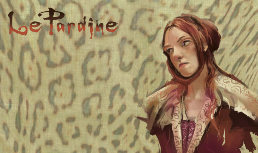
Lunch time painting exercise. Not exactly the same colors from reference but used colors I like. I really like the neutrals and eggplant colors. A good portion of Quinacridone Blue Violet, Burnt Umber, Light Blue Violet, tiny percentage of Cad Red Light and Hooker's Green for weight in the darkest shadows. Don't know how far I will take this. Sketchbook and acrylics
New Flag
Sunday, August 16, 2015
Friday, August 07, 2015
Tuesday, August 04, 2015
Front and Back: Dragons were inked in Illustrator with "charcoal" brushes found off the internet to create more of a subtle sketch quality, then brought into Photoshop with the same swirl pattern to relate to the front design. They are based on some quick thumbnails of dragons that I had drawn here and there. This concept for the back was a suggestion from my old art director, Sergio Lobato. Up until then, I had not even considered a back side of the card. The front will be gloss (to enhance the colors and impact); the back matte.
I have always loved poster art and this design is like a mini poster, in the tradition of poster art before PS completely took over, and imagination, composition, and color was kicked by the wayside.
Subscribe to:
Posts (Atom)