New Flag

Red Head
Sunday, April 29, 2012
Tomb Raider
n
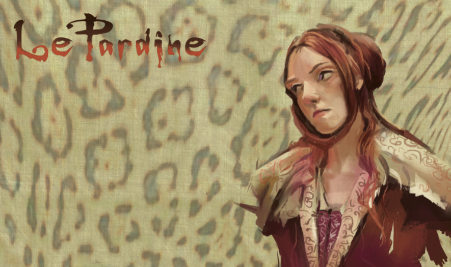
Finis~I put some red in the nose to warm up the flesh a little. This one turned out really nice. 9"x4 1/2", acrylic on Bristol paper. This one was such a departure from the mood of the previous shots from Elizabeth: The Golden Age, it took me a while to adjust but I do have more shots I would like to paint from this darkly shot film.
Thursday, April 19, 2012
Up and Coming:
Tomb Raider
I snuck in those guest colors, Aliz Crimson and Light blue Violet, albeit just a tiny bit. The candles were white in the screen shot, but I made painted them in a cooler range. This piece has been really tough. I don't normally try for a direct likeness and have missed that gamin, adorable look on Angelina's face. Oh well..This really has nice movement and the original is stunning. The hardest part is to keep the painting fresh, not get too noodley on the details. Keep it loose, keep it simple. Oh, and I tried this fancy, shmancy paper I found in the Disney Consumer Products drawing room, "Strathmore 500 Bristol" it says stamped on it, because yours truly remembered to bring everything but the substrate to paint on (Friday) in drawing class. It's smooth pedigreed surface almost threw me into a loop after painting on the rough cheaper surface of the water color tablet for my Elizabeth: The Golden Age series...enjoy! Will post this later when finished!
Monday, April 16, 2012

Elizabeth: The Golden Age
A visit back to the screen shots. I went for a bigger format, 8" by 5" roughly, on a thick watercolor sketchbook. I found while I do really enjoy painting the screen shots and have really missed doing them, I needed a bigger surface so that I can concentrate on turning the form with warms and cools. I brought the pallette down to 7 colors: black, white, Hooker's Green, Cad red light, yellow ochre, Magnesium Blue and I will sneak in a few "guest" colors from time to time if I get a screen shot that needs a specific color.
This film was beautifully shot; Kate Blanchette just glows like alabaster in this one, partly because of the natural light and partly because of the white paint she wears. There are some shots in which she moves in and out of natural sun light~breath taking~so expect some of the same shots painted but with different lighting. I will post more when I get some time.
Sunday, April 08, 2012

Some head studies done at Disney Consumer Products, most of them at 5 minutes. The drawings were done at the Los Angeles County Museum of Art, which is now expensive...$15 admission fee, $9 to park and it opens up at 12 noon! And they guard the exhibits like Nazis...they would not allow me to bring out my mini kit of acrylics that I premixed in ANTICIPATION to use. Only pencil. Not the best place to study..any suggestions to study dynamic light on figure where I can crack open the acrylics? Anyone??
Subscribe to:
Comments (Atom)


